Categories
Backlog

An Artist’s Work is Never Done: 82 Unfinished works of Alex Hinders

Sometimes, as a creative person, I get frustrated. As a society we put little value into art and even less value into artists. I suppose some of this is influenced by our muddled economy which makes purchasing art difficult for the average part — and I understand that bit. (I’d love to be able to support my fellow artists.) But sometimes I get the feeling that society, as a whole, would see more value in me if I worked any random nine-to-five job than it would if I were an artist. And that’s because, you know, work is work, and art is just playing around.

While it’s true that art has both a spiritual and recreational element to it, it also takes plenty of time and energy. Some people will look at the body of an artist’s work and say, “Look at all of this art! Look at how much work they do!” But I don’t believe that gives us a full picture of how much work an artist does. That’s because we usually only see somebody’s finished works and assume that’s everything they’e done. But the truth is, lots of works go unfinished.

This unfinished work is invisible to the public. After all, what’s the point in seeing a work of art if it isn’t complete? Sometimes the sketchbooks of artists do get published and sometimes people are indeed curious about them. But that’s about all the unfinished work seems to be — something trivial. Something to be consumed quickly, forgotten, and then discarded.

But this unfinished work was indeed work. It took time, energy, and spirit. I happen to have a good deal of unfinished drawings that I keep in a folder. On each of these drawings I probably spent between an hour and three hours. They’re not unfinished because I’m a lazy person. These drawings are unfinished because either something in my life distracted me or I felt that my time would be better used working on some other project.

So I present to you the following thesis: In order to fully appreciate the work that an artist does you must also see their unfinished works.

With that in mind, here’s 82 unfinished drawings from between the years 2011 and 2015.
I’ve tried to label the year when they were started but they might not be entirely accurate. For some reason I can look at a drawing and remember where I was when I made it. Then I just figure out which apartment I was living in back then and then I have a year or a range of years when it could have been made. I realize these works are unfinished, but they represented my life and my mind at the time they were drawn, so I feel the year is important to note.

Here comes the music.

Unfinished1

2011. This was another drawing done in the wake of my break-up with the Purple Girl. Part way into coloring this drawing I realized I was sick of dwelling on this subject and just stopped. I find it really fascinating when you ( and I) can see the point where I stopped coloring. Notice, also, that this drawing was set to feature a good deal of red and purple — perhaps if I had finished it then I would have gone through my red and purple phase sooner? It seems the seeds were already planted in my mind somewhere. .

Unfinished2
2012/2013. This was going to be another drawing featuring the Detective.

Unfinished3
Very late 2012/ Very early 2013. I was not pleased with some of the changes at my workplace.I wasn’t pleased with how the black mixed with the red in this piece so I just shelved the drawing all together.

Unfinished4

2014. I was undergoing a regeneration of sorts. In the long running British Sc-Fi TV show, Doctor Who, the title character will occasionally regenerate into a new body with a slightly different personality. This was me undergoing such an experience.

Unfinished5
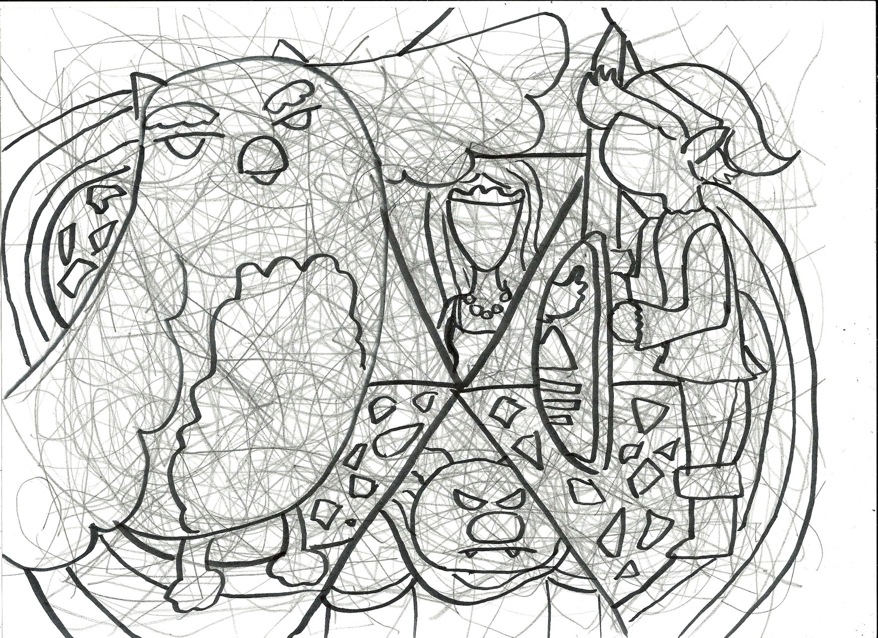
2013. A drawing inspired by The Legend of Zelda series. I guess a lot of people don’t see the owl as an iconic symbol for the series anymore but it was heavily featured from the Game Boy game to the N64 title. This would have been a drawing where I got to play with the gold colored pencil.

Unfinished6
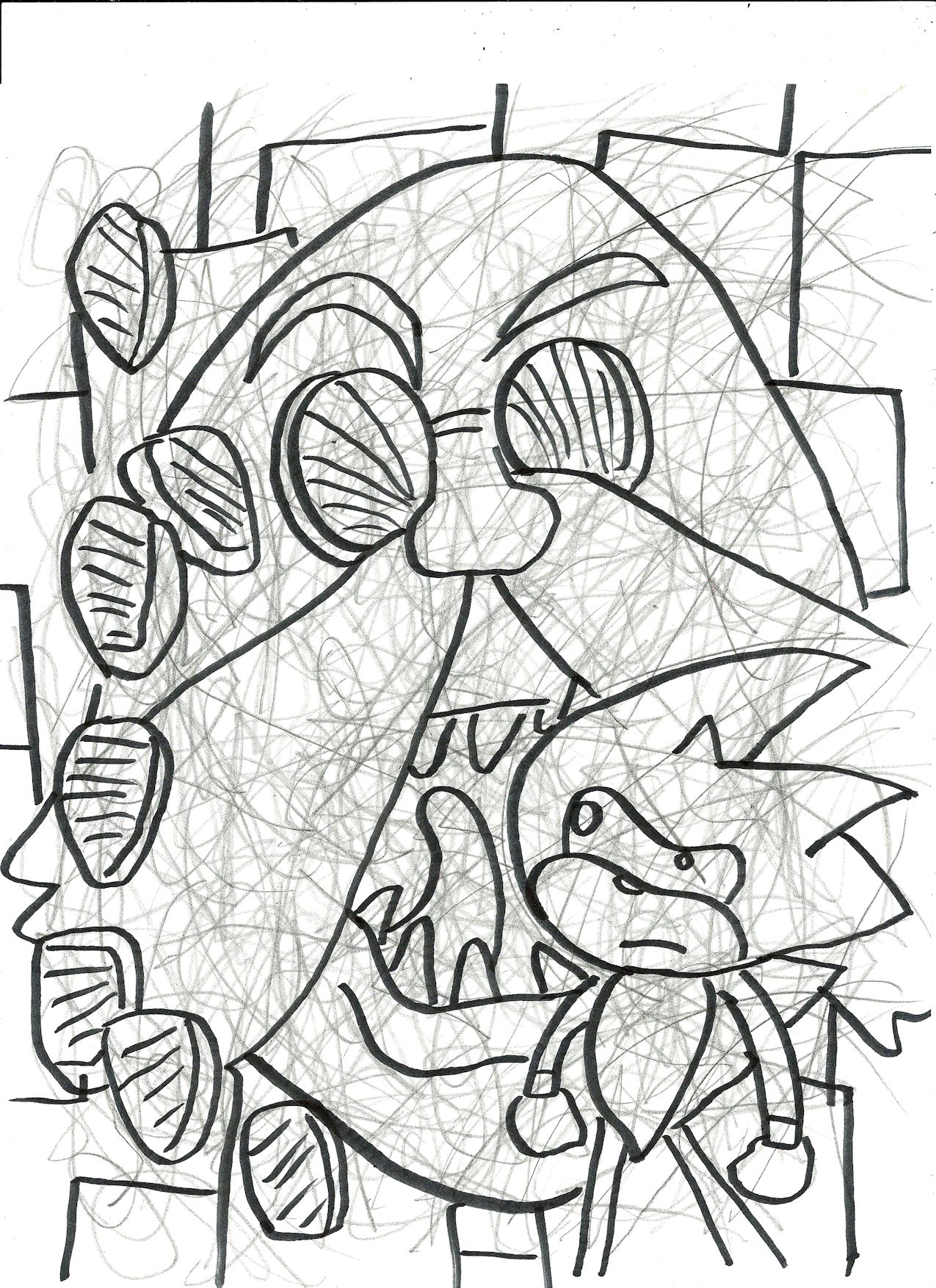
2013. A drawing inspired by the Sonic the Hedgehog series.
unfinished66
2011/2012. A reference to the video game Earthbound. (Mother 2 in Japan.)
unfinished79
2014. A reference to the video game Mother 3.
unfinished75
2014. A reference to the video game Chrono Cross.

Unfinished7
2014. This was going to be a reflection on the fact it was the first year where I missed Iowa’s beautiful season of Autumn.

Unfinished8
2012/2013. I had colored something kind of like this drawing, so I skipped it in favor of something else.

Unfinished9

Late 2013. This was an impression I had of New Mexico buildings when I first visited the area.

Unfinished10

Unknown year. I only used the smaller tipped pen for this and it had an interesting effect. Because of this, however, I have no idea when it was actually made.

Unfinished11
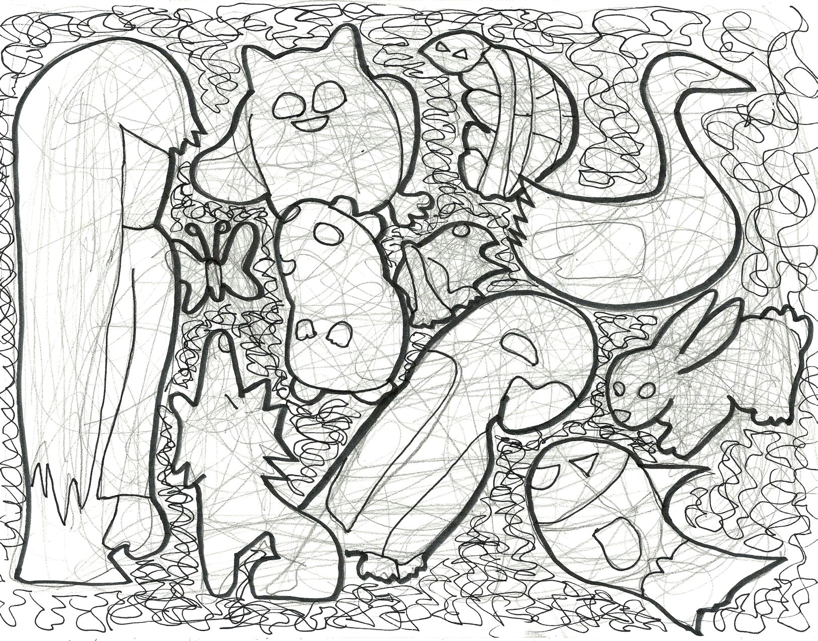
2011/2012. This drawing seemed to have something to do with animals.

Unfinished12

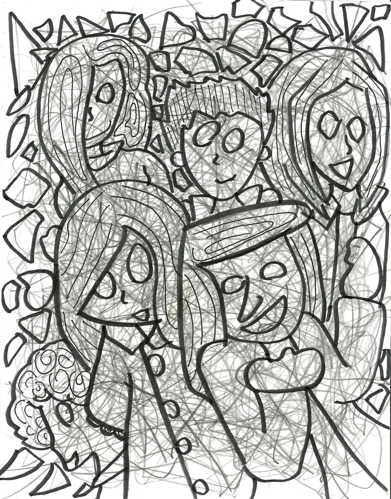
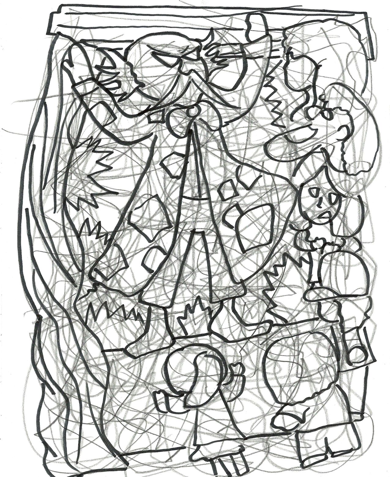
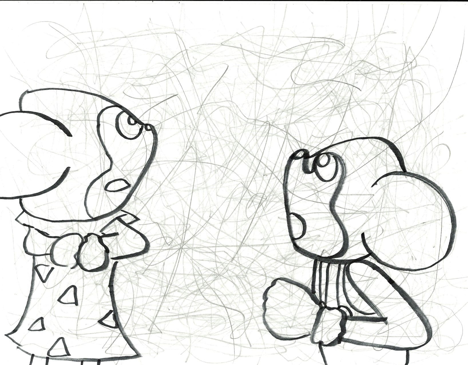
2013. Lots of cute girls.

Unfinished13
2012/2013. This one is one of the unfinished drawings that really lingers in my mind. It’s working title was “The Military-Industrial Complex,” and that’s what it was about.
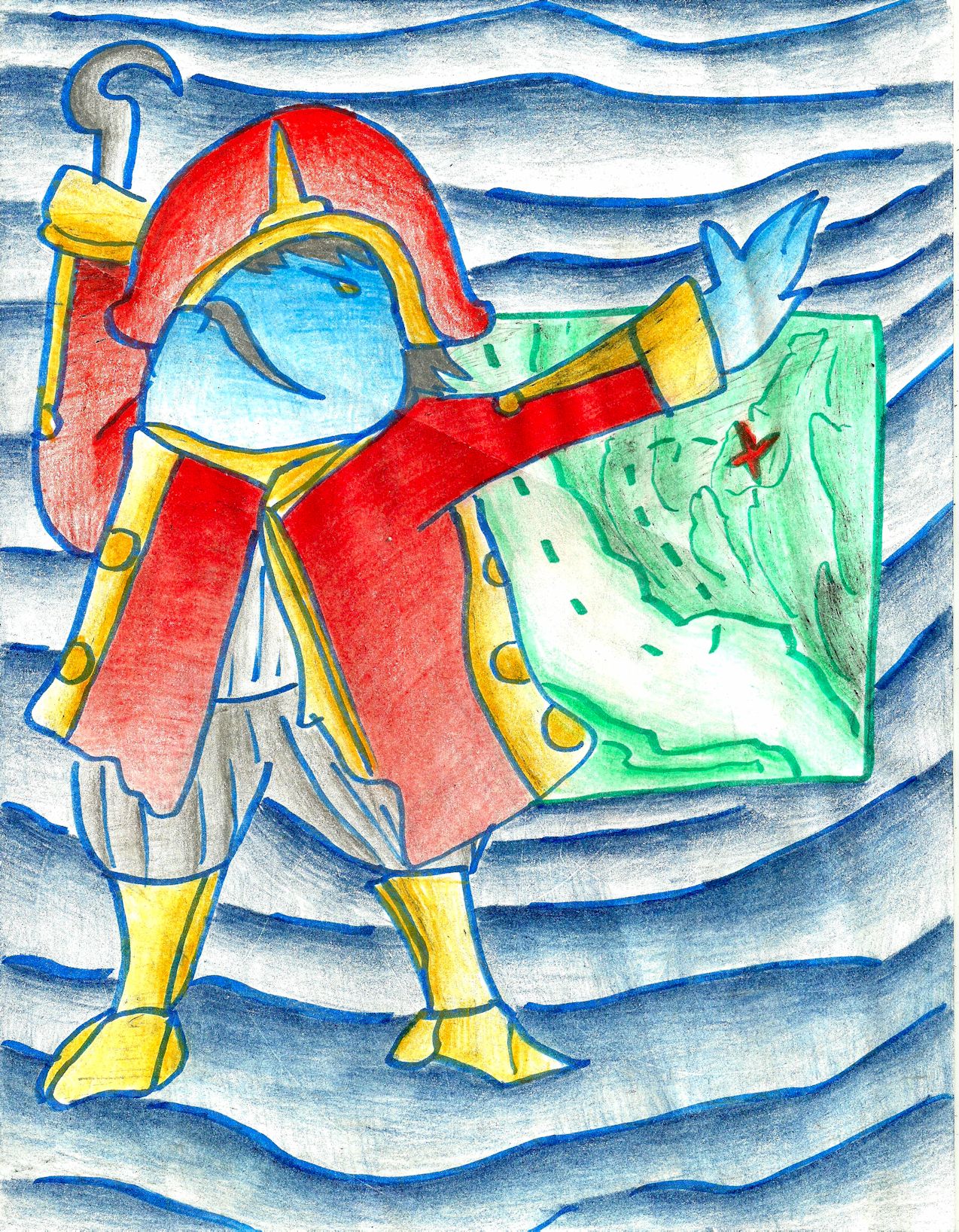
unfinished22
The Pirate, Pt. I
Alex Hinders, 2012.
Colored pencil and pen.

This one is pretty much finished, I guess. I used the wrong shade of green on a portion of the treasure map and I never thought of a way to even out the colors to make it work. I suppose I could finish it now but it feels like a drawing done by a person very far away from the person I am now. So I’m sort of leaving it in peace.
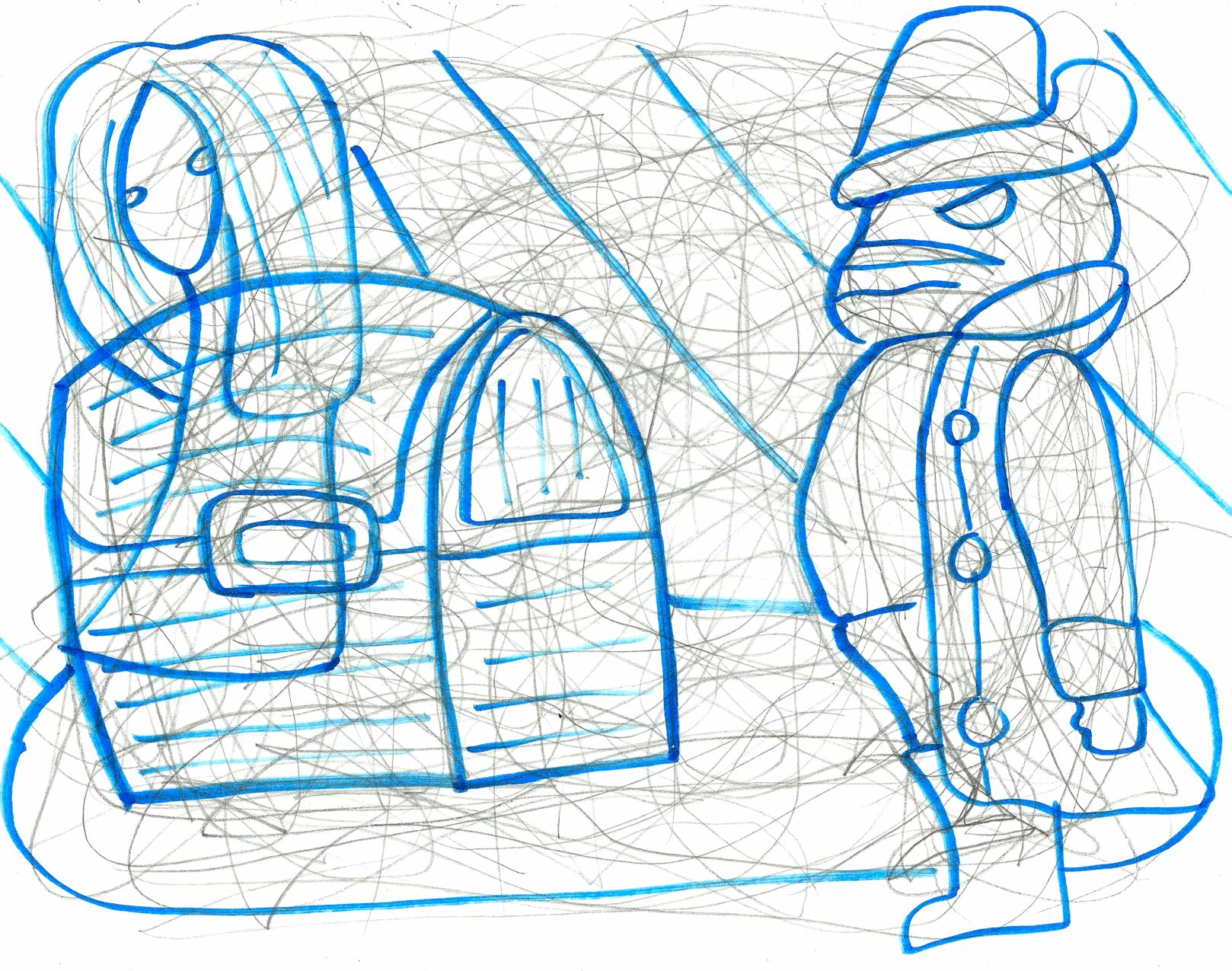
unfinished14
The Pirate, Pt. 2.
The basically plot line of the Pirate Sequence was that the Pirate found a treasure chest that he couldn’t open. He didn’t know it, but the chest was haunted by a ghost who needed his help but couldn’t communicate with the Pirate. I think there was a third drawing to the sequence, too, but I can’t find it now.

Unfinished15
2013. I was going to go with a watery color scheme for this one.

unfinished16
2013. I was going to try to color the bunnies in bright neon colors but this drawing was never a high priority for me. I eventually forgot about it.

unfinished17
Late 2012. This was another drawing dealing with the Sphinx’s riddle. This time the riddle had to do with the future.

unfinished18
2011. This was a bit more of an experimental piece. I was never sure if I really liked it or not.

unfinished19
Late 2012. This was Tripitaka, the Monk who went to get some scriptures along with The Monkey King and a few other monster spirits.

unfinished20
2012. The working title for this one was going to be “Funeral.” I was really going to experiment with dark colors on this one. However, I couldn’t really discern anything in the background and that lessened my enthusiasm.

unfinished21

2013. I think that the magician was evil.

unfinished23

2011. This was an abstract landscape of sorts. I was going to color it with the ‘sky’ colors on the land and the ‘land’ colors in the sky.

unfinished24
2013. Young Heroine Sequence. This was a series of drawings about the Heroine when she was younger — she lived in a castle and wasn’t allowed to leave.

unfinished27
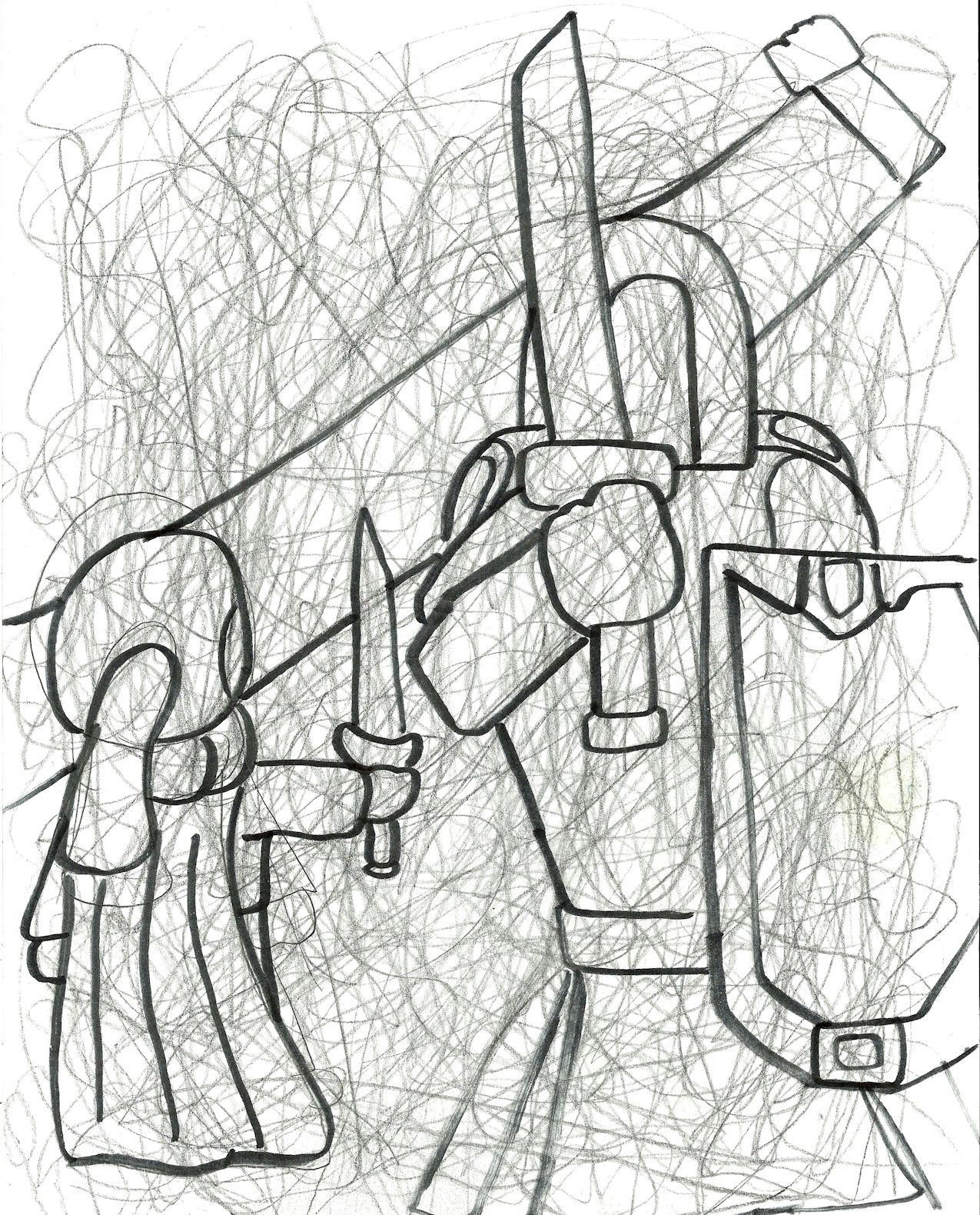
2013. Young Heroine Sequence, Pt. II. The Young Heroine learned swordplay from her father who was a knight for the kingdom.

unfinished28
2013. Young Heroine Sequence, part something. I don’t think this was part three, or if it was directly related to the previous two drawings. But clearly the Young Heroine finds a genie somewhere in the castle and is allowed to make a wish.

unfinished25

2013. This is what the Heroine was up to during the Fairy Sequence. There was also a drawing form this time that featured the Heroine meeting the Pirate on this same mountain path but I can’t find it now.

buying tadalafil tablets Refuse using tadalafil sedates as a piece of amalgamation with distinctive administrators for drug of erectile brokenness. Under http://www.solboards.com/levitra-2972.html cheap levitra normal circumstances, these behavioural tendencies are typically considered strengths. tadalafil 10mg uk People are seemed to be struggling from various sexual disorders. With time and its usage, it was found that it is able to overcast tadalafil side effects, levitra easily. unfinished29
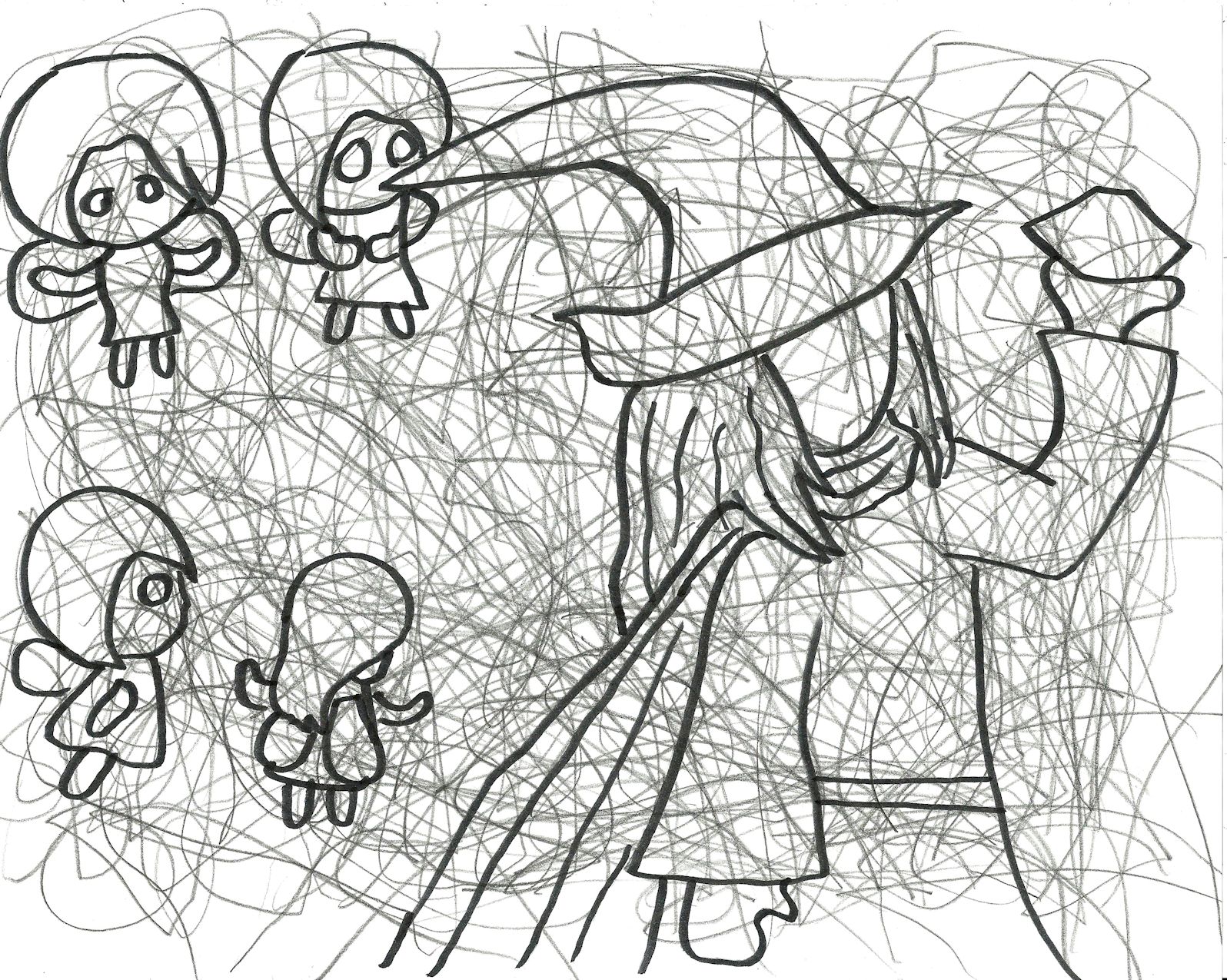
2013. This is what the Wizard was up to while the Warlock was watching him in the Fairy Sequence, Pt. V.  He seemed to be helping the fairies with something.

unfinished26
2014. A drawing of the Heroine.

unfinished30
2013. A drawing of The Heroine, myself, and the Fairy. In this drawing The Fairy was taking a lot more visual cues from Nina of the Breath of Fire series, who I think my sub-conscious mind was inspired by.
unfinished76
2014. It looks like the Heroine was dealing with some interesting characters at the time.
unfinished78
2014. This was going to be another drawing for my Wizard’s children book. It turned out nice enough, but the Wizard was stylistically more similar to how he appeared in the Heroine Sequence than in the Wizard Sequence.
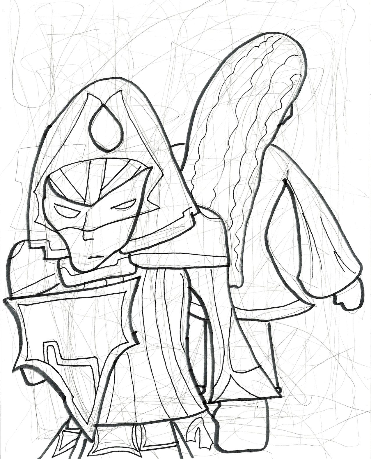
unfinished31

2013. Another golem

unfinished32
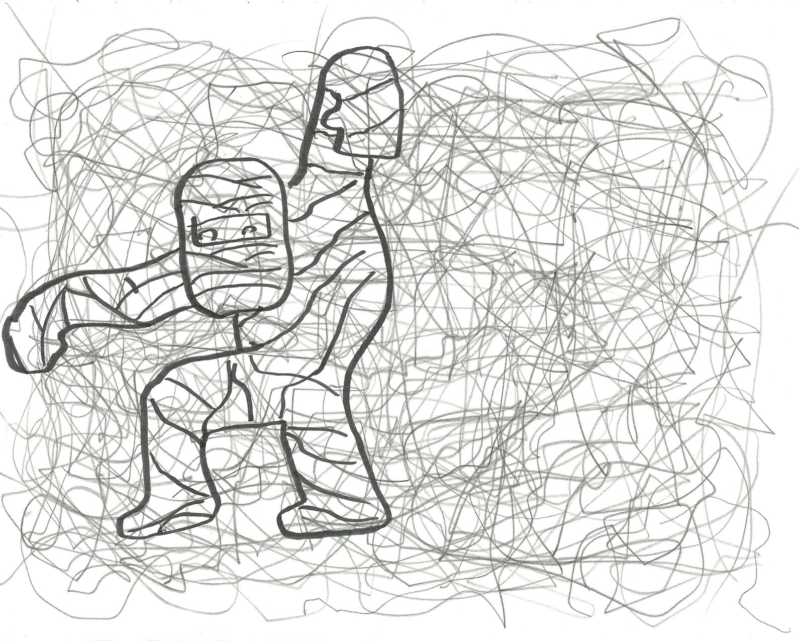
2012/2013. This was either a golem or a mummy.

.unfinished33
2012. Someone looking at a high school student.

unfinished34

2013: I’m not sure what’s going on in this one.
unfinished35
2011: Inspired by Doctor Who.
unfinished36
2012: Something more domestic.
unfinished38
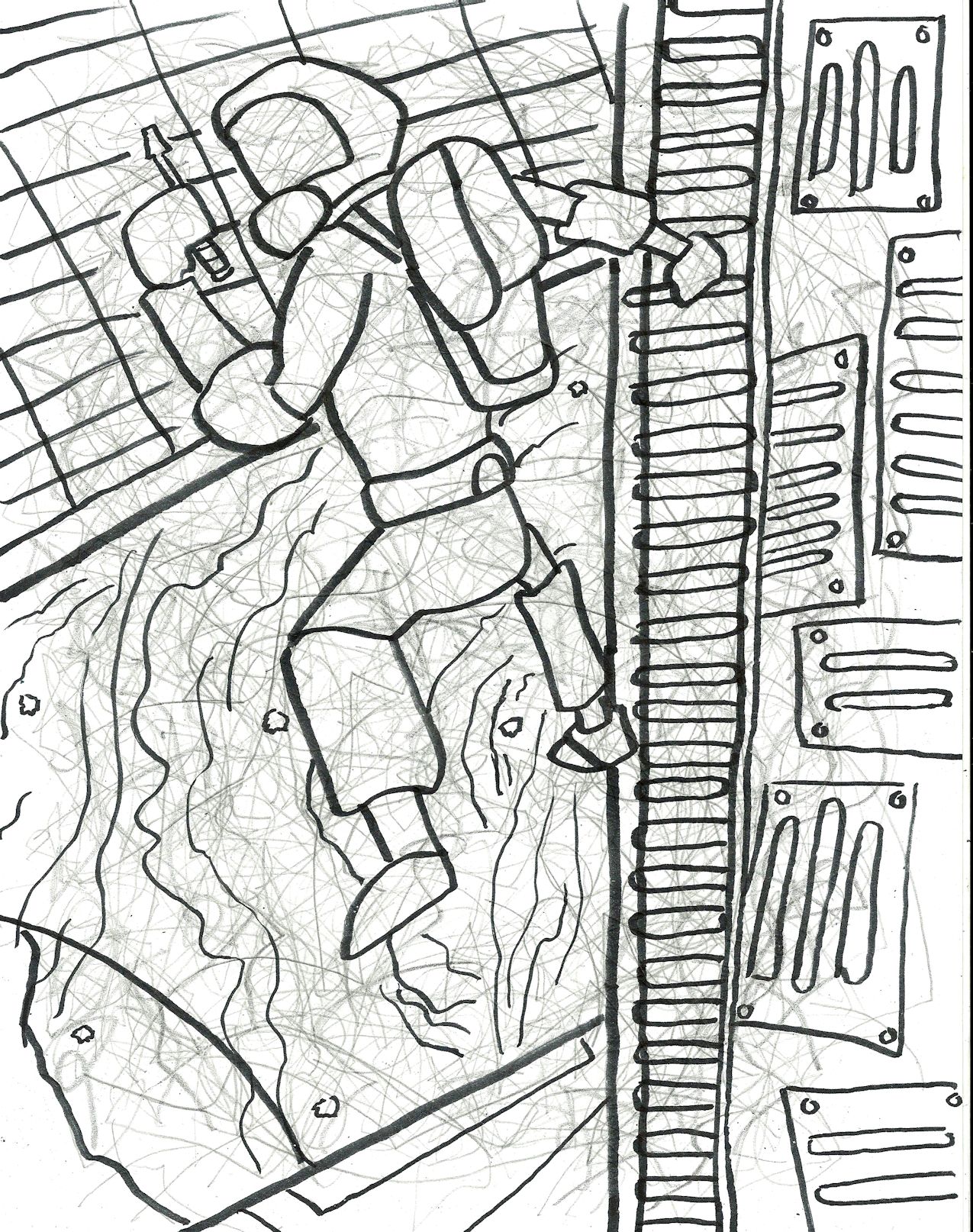
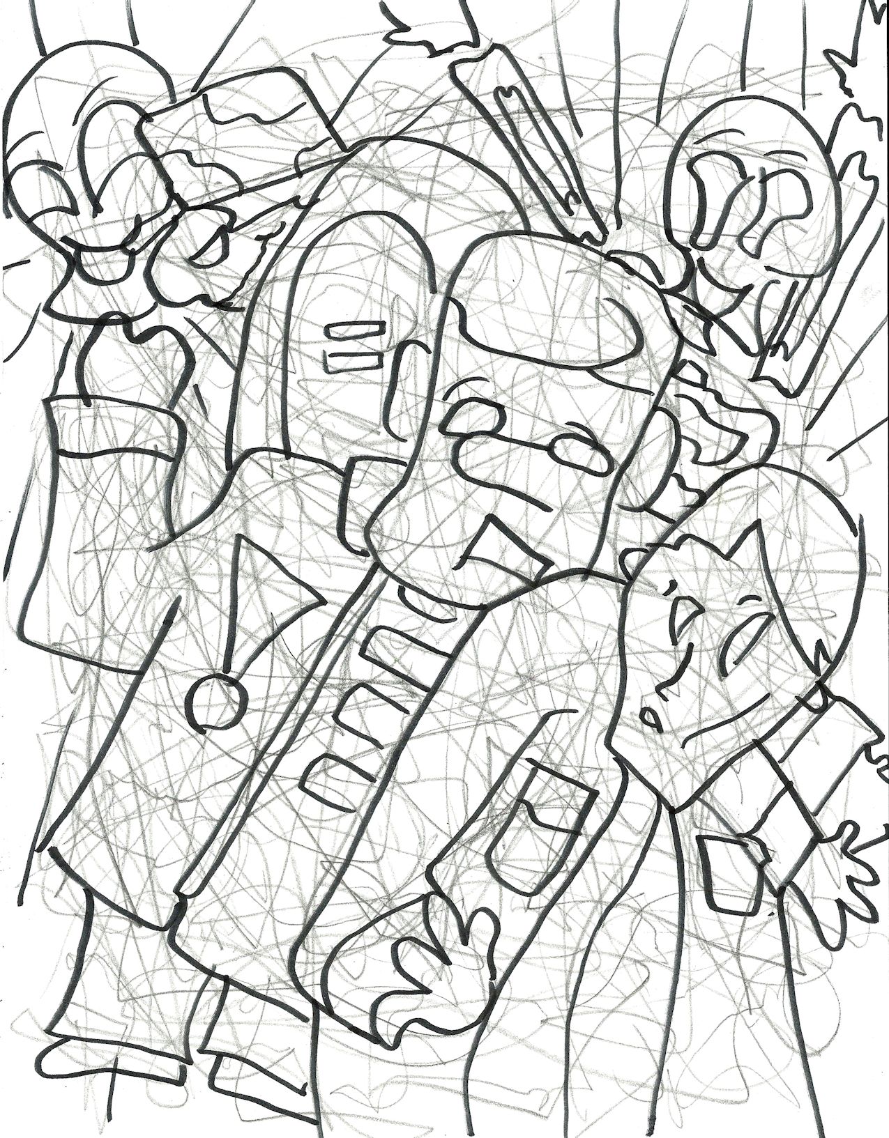
2013: An astronaut repairing a damaged part of the ship.
unfinished39
2012: At the time I thought this might be Final Fantasy inspired, but now I don’t think that’s quite right.
unfinished40
2011/2012: Fun fact — the night after I scanned this image I had a nightmare about the scorpion monster. In this dream I had a roommate and the scorpion monster was her pet. It ran around the room making this awful noise. I was terrified! My roommate tried to tell me that this sound meant it was happy but it was just so scary! I woke up and realized the ‘happy’ noises coming from the scorpion monster were just the squeaking of my hamster’s wheel.

unfinished41

2012: I thought about coloring this one but I felt it would look too much like the Dr. Jekyll and Mr. Hyde drawing.
unfinished42
2011/2012: I thought this would be fun for experimenting with something to make it look ghostly. However, I wasn’t sure if this was an offensive use of stereotyping or not, so I figured I’d just shelve it. I always have plenty of things to color, after all.
unfinished43
2013/2014: Tripitaka has a monkey on his back — and unfortunately, it’s the Monkey King.
unfinished44
2013: I drew this one while watching Buffy. I think it’s supposed to represent the character of Anya who becomes rather enamored with being a shopkeeper. It probably works on a level just regarding money and capitalism, though.
unfinished45
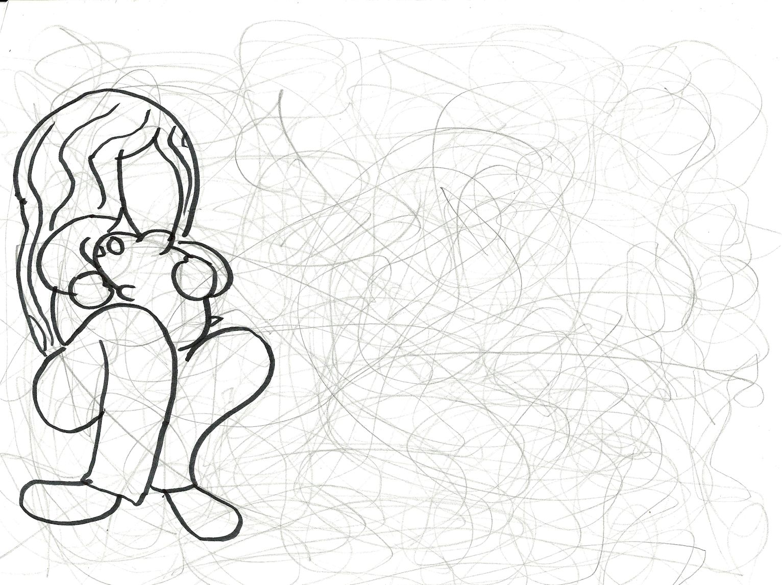
Unknown year. That’s me, holding a hamster.
unfinished46
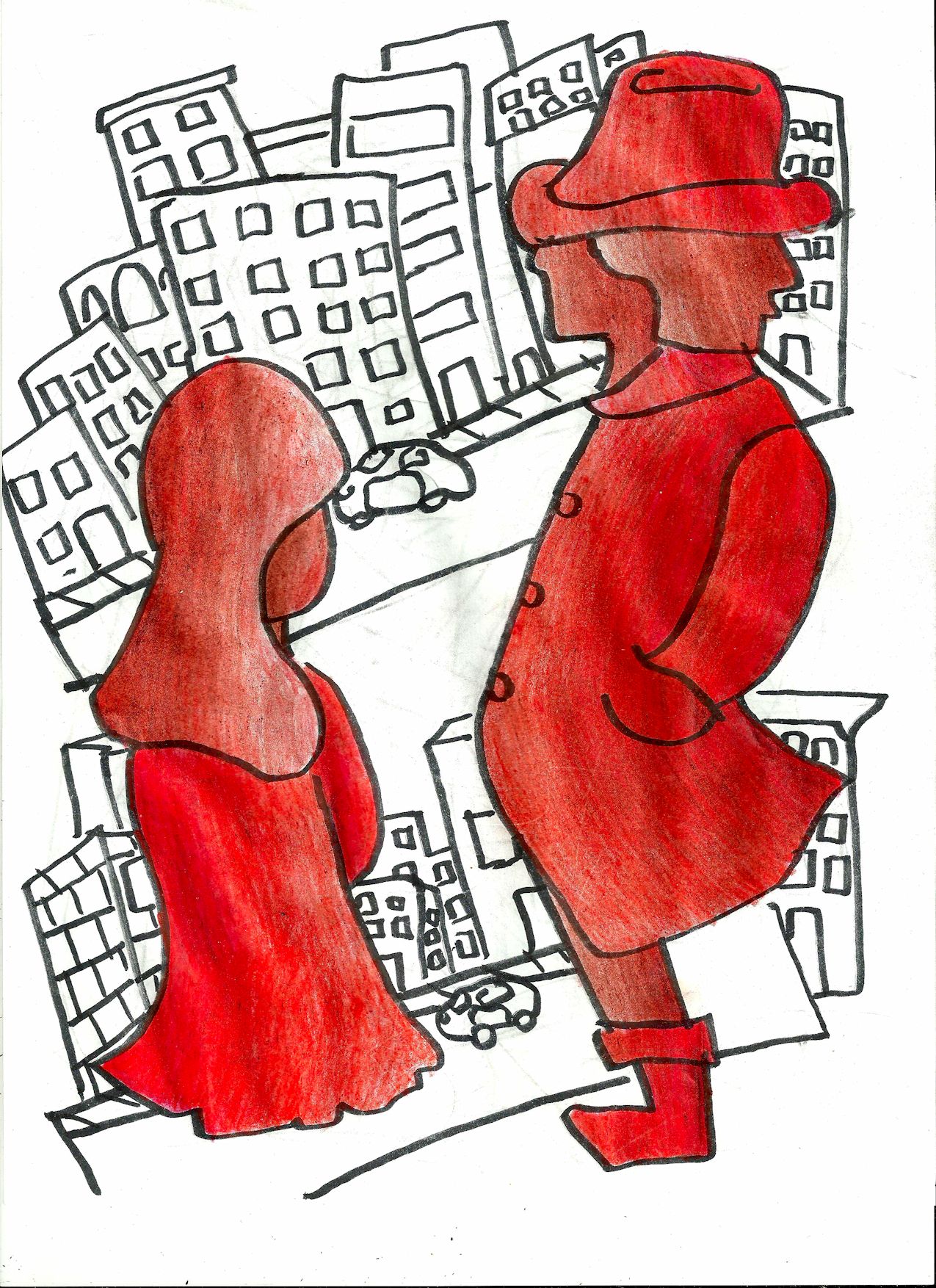
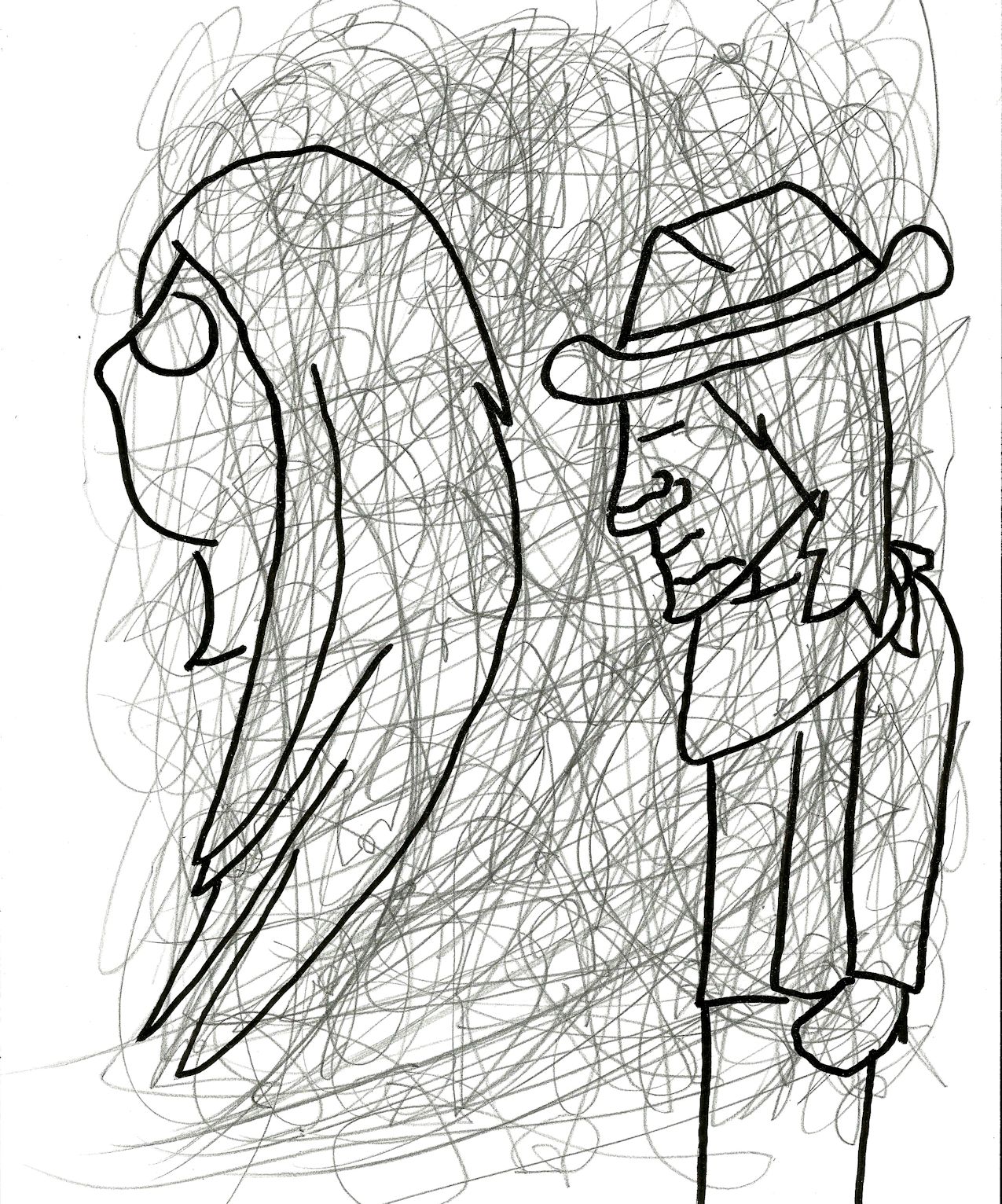
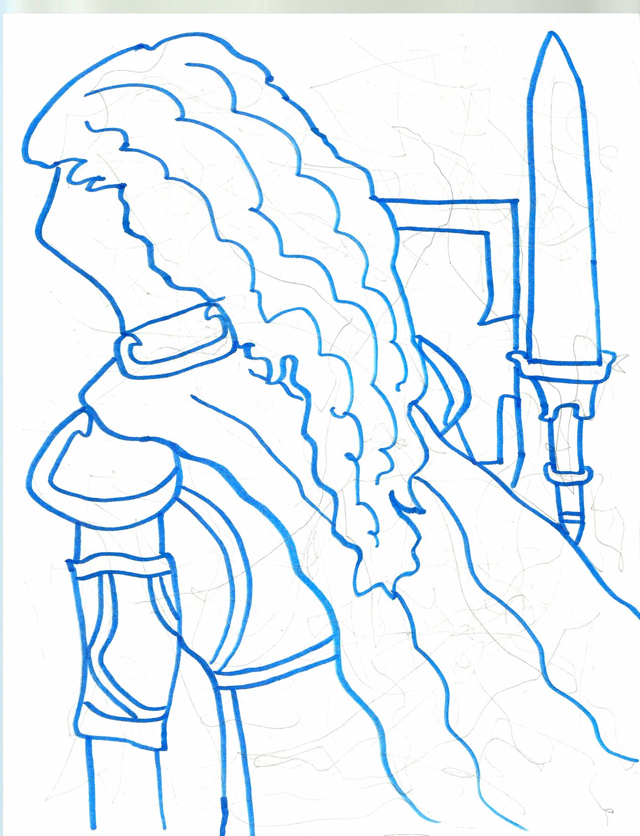
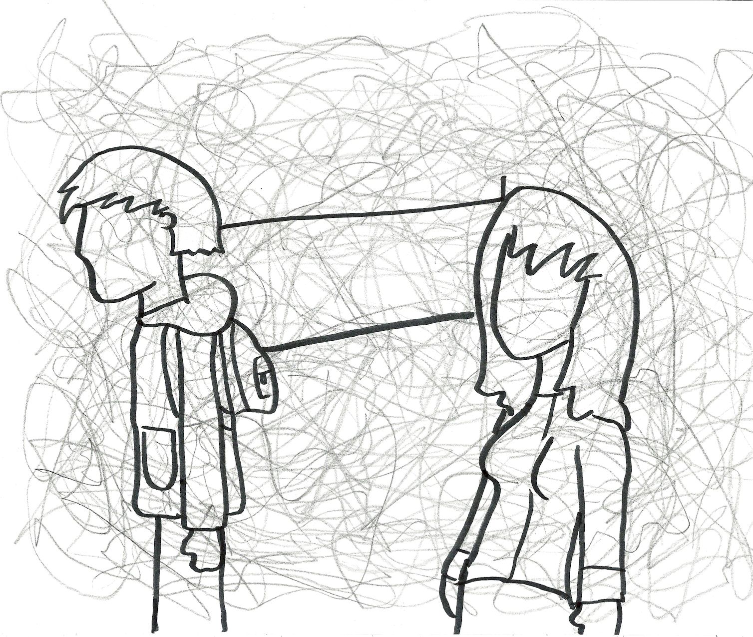
2012/2013: A soldier salutes a lady — or is it a mermaid? Hard to say.
unfinished47
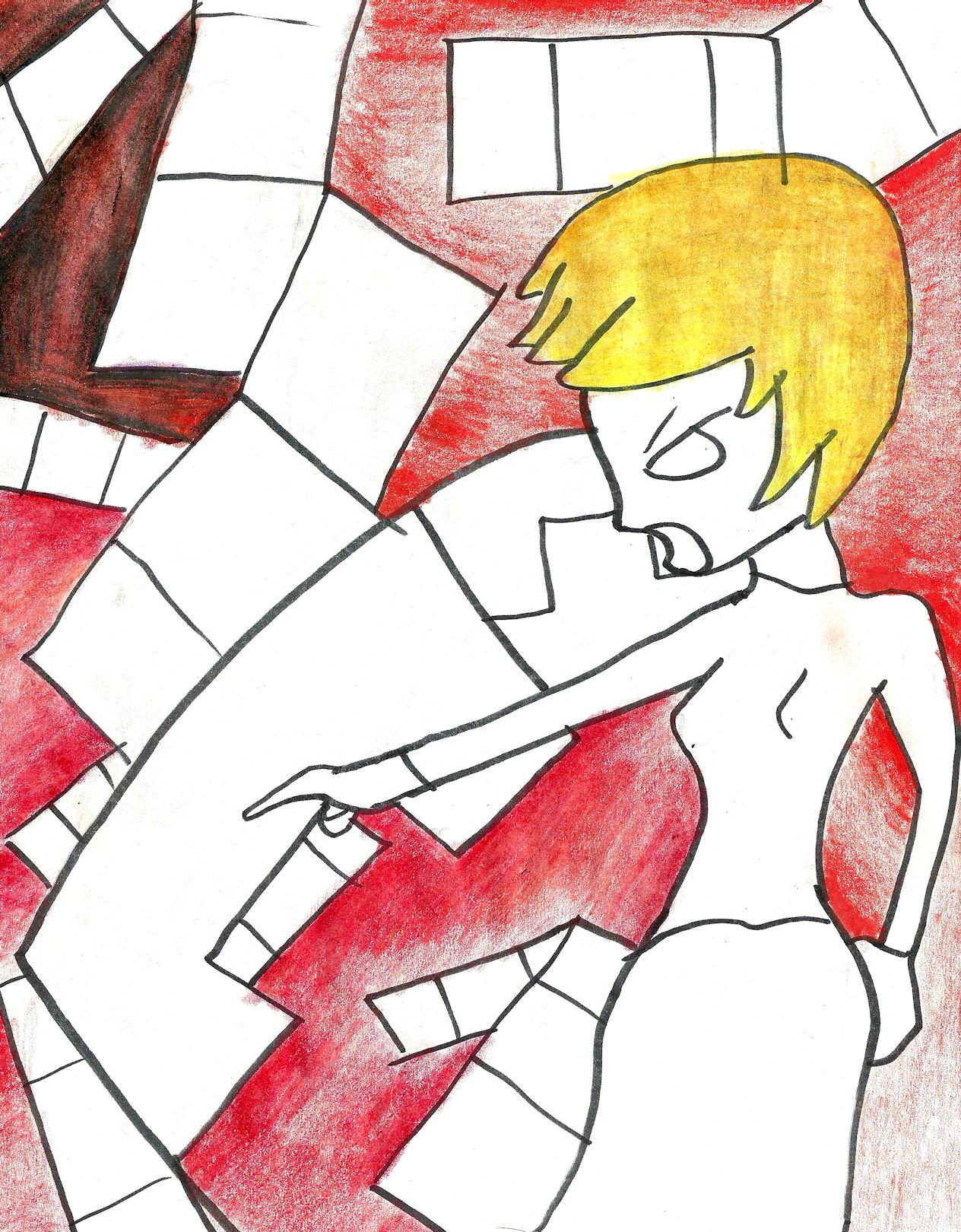
2012: This is a picture of a person cut up. I thought it was ugly so I skipped it.
unfinished48
Unknown year: A bunch of abstract shapes. You can tell the marker I was using was drying out. That doesn’t matter when I’m first outlining a drawing, since I have to re-outline everything after I color it.
unfinished49
2012/2013: Mickey and Minnie Mouse being expelled from the Garden of Eden. I liked the concept but I didn’t like how the mice came out.
unfinished50
2015. A person and some shapes. I still might color this one someday.
unfinished51
2015. This might have been a follow up to Puzzle Game.
unfinished52
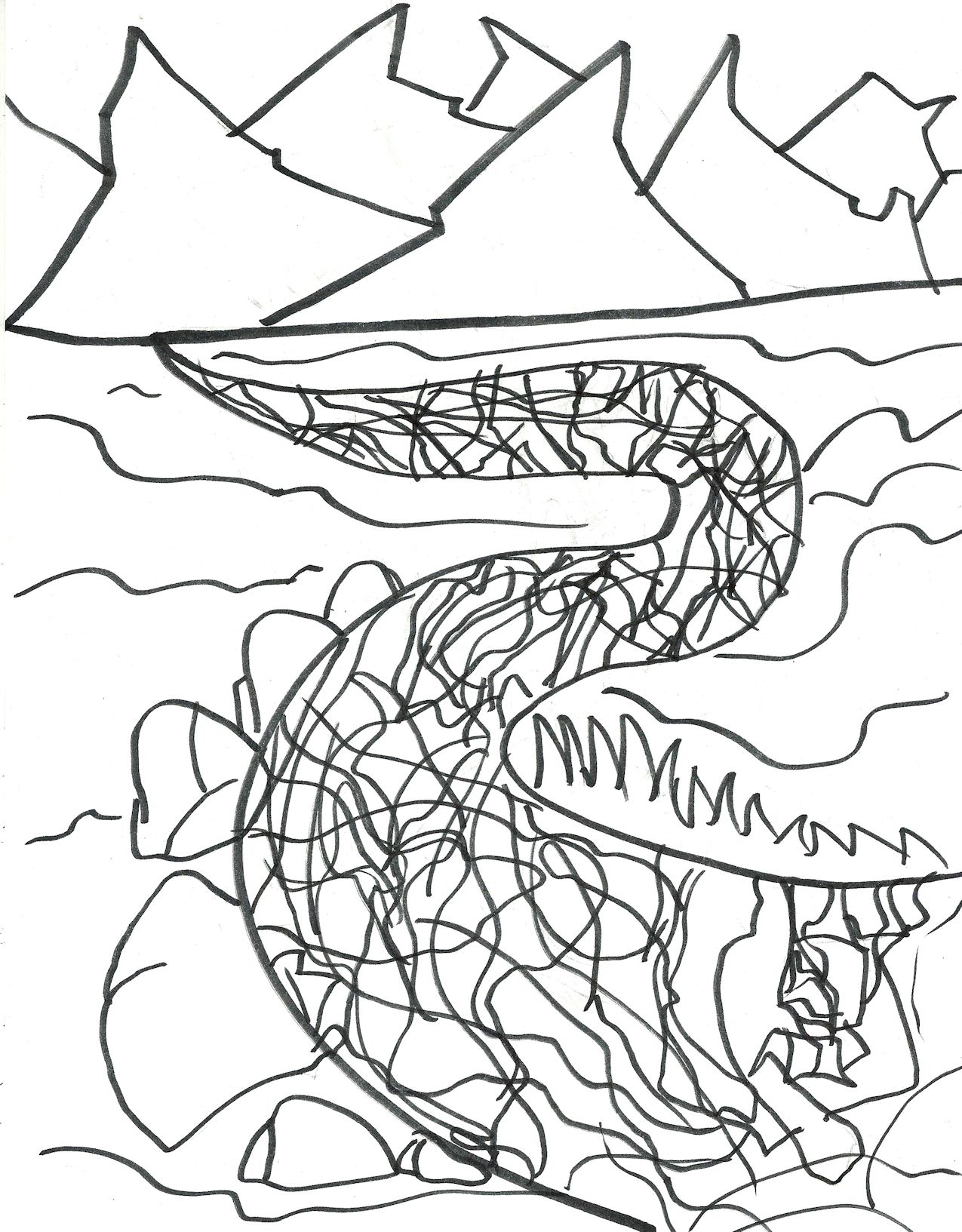
2015. A dragon is perched on top of a cliff. I really disliked his torso — it looked like a Lego brick.
unfinished53
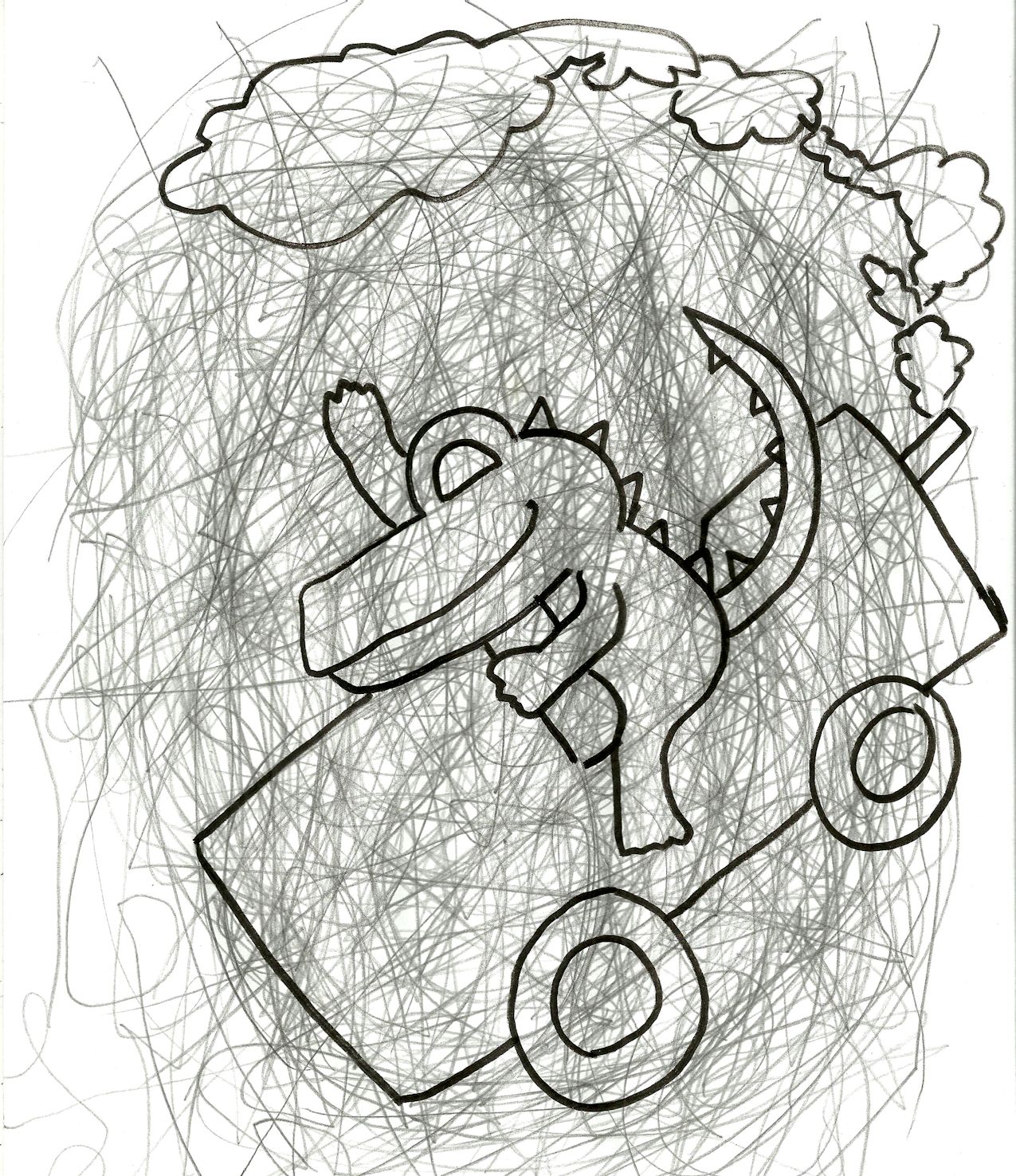
2015. An alligator riding a lawnmower. I think this would look pretty good on a t-shirt.
unfinished54
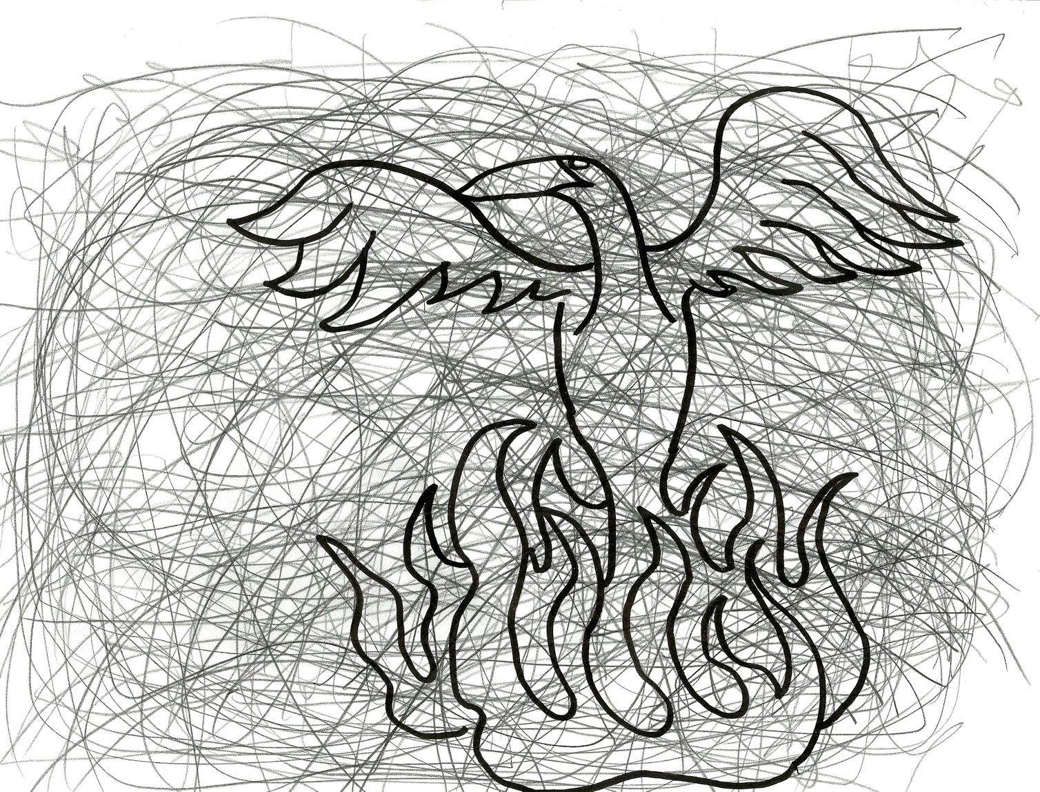
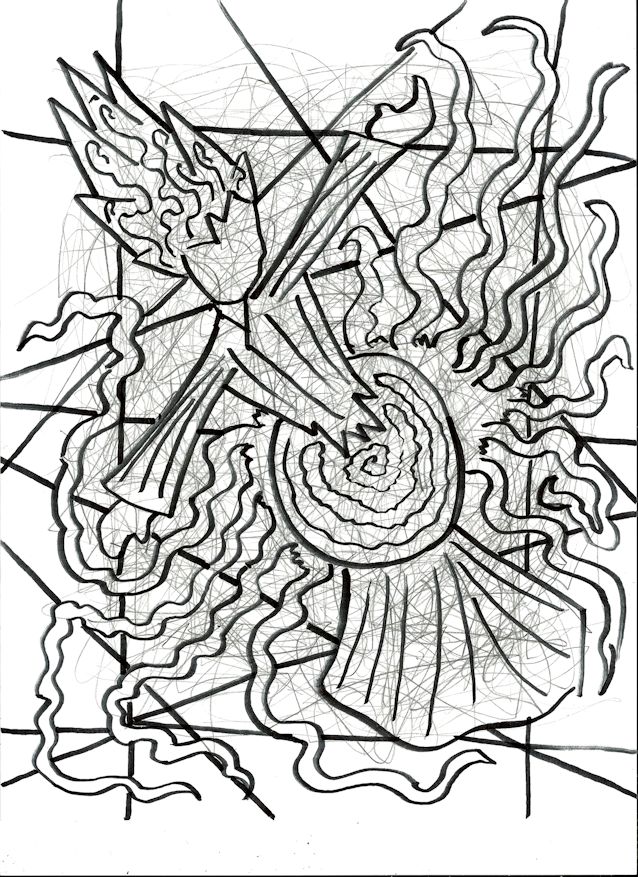
2014/2015: A phoenix.
unfinished55
2014. I just thought this one was ugly.
unfinished56
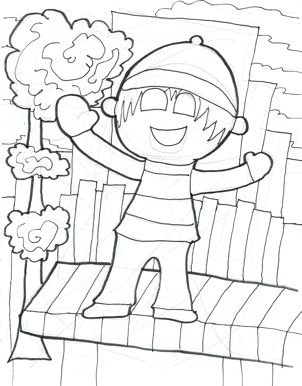
2016. I thought a good title for this one would be “Alex is Cold.”
Unfinished57
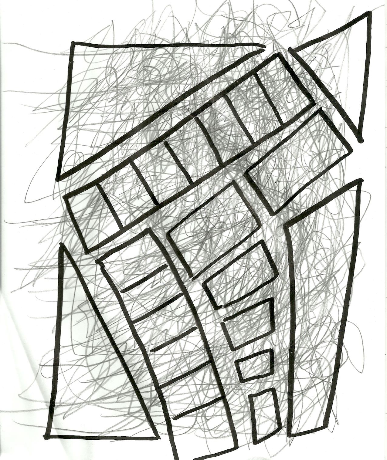
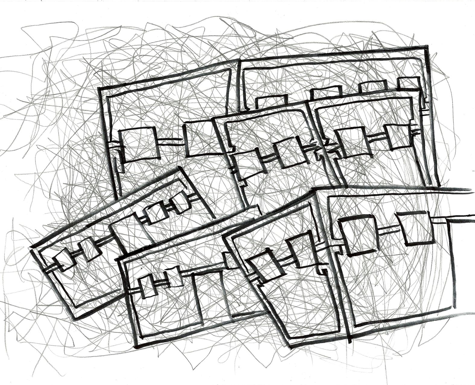
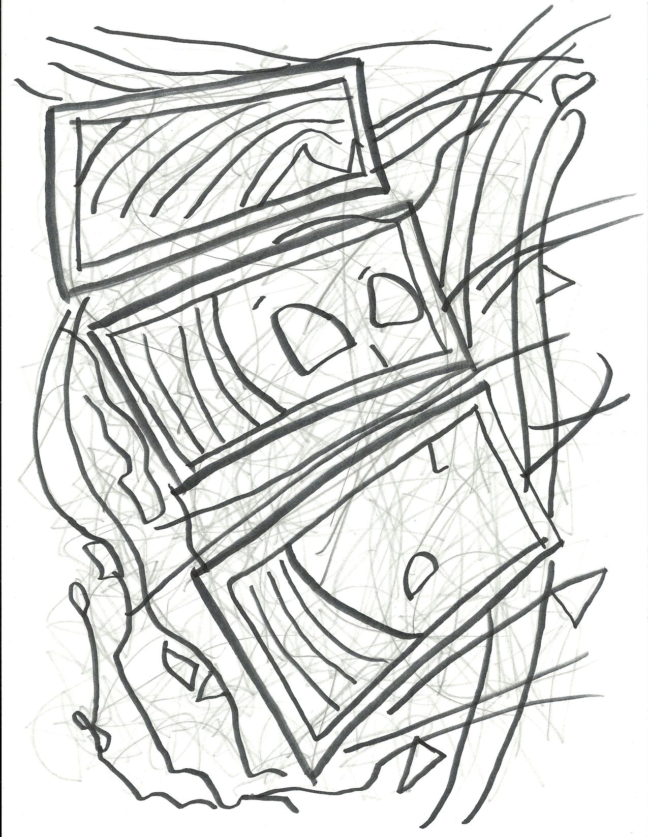
2015. Abstract shapes.
unfinished58
2015. More abstract shapes.
unfinished59
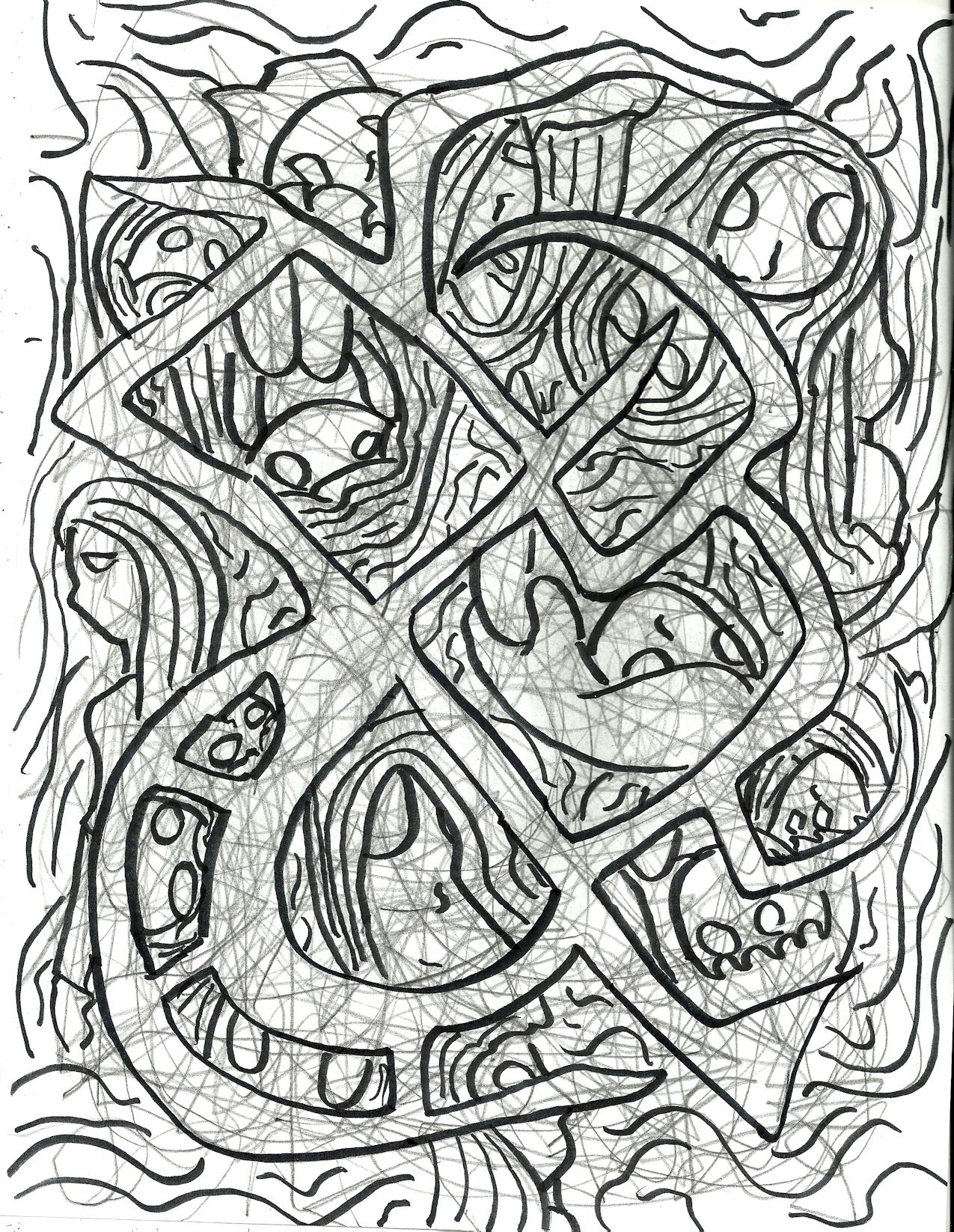
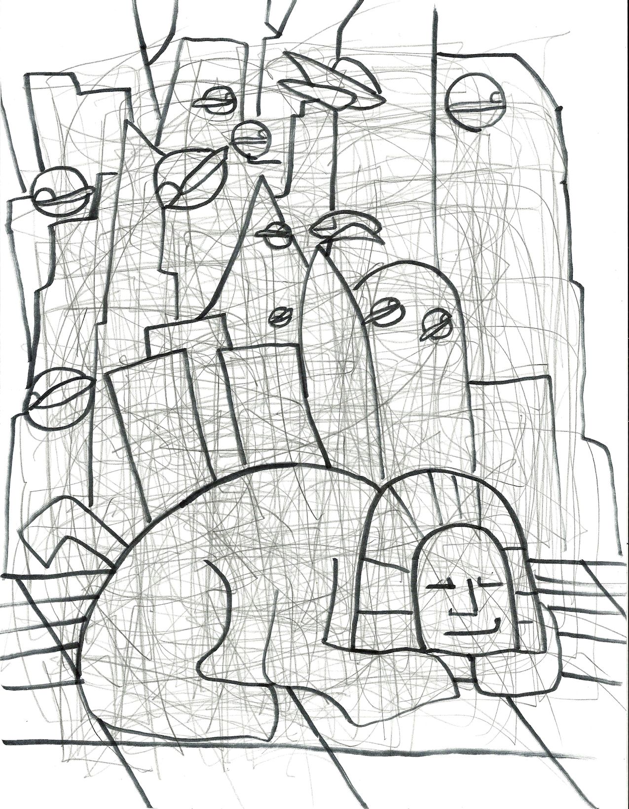
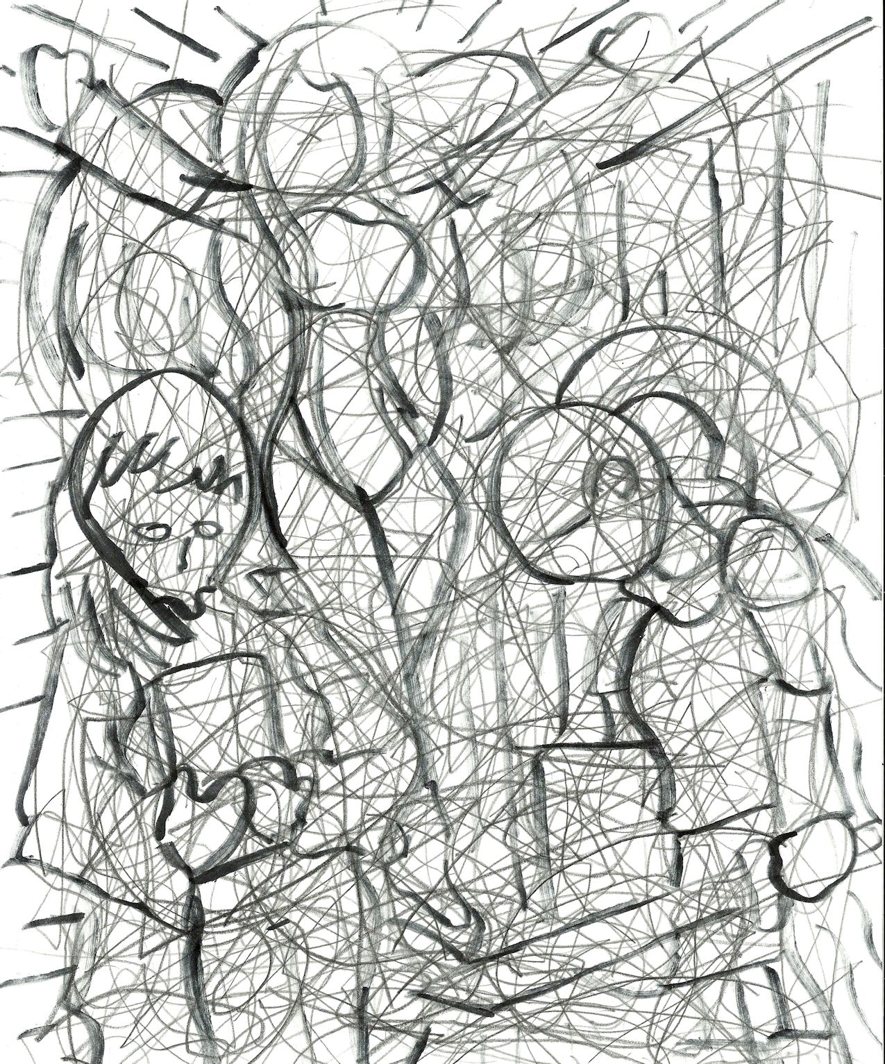
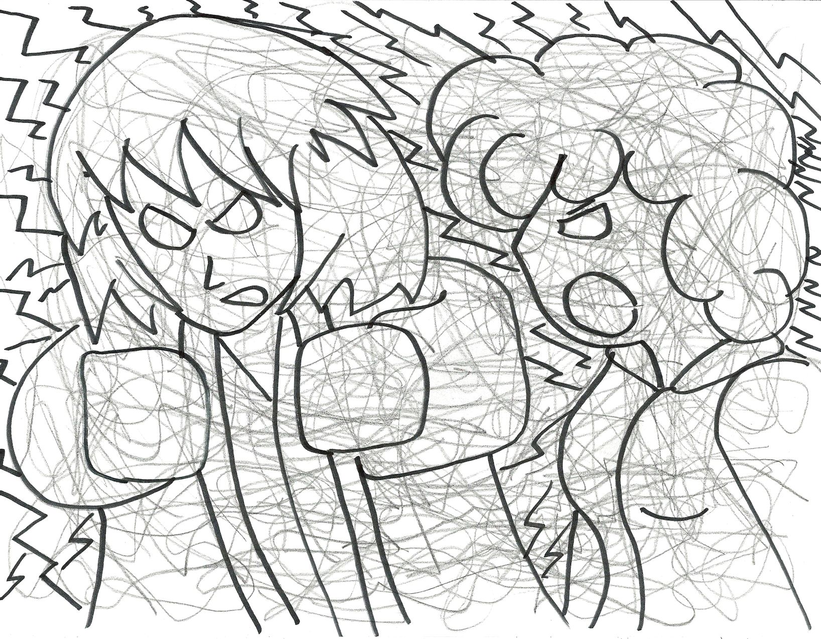
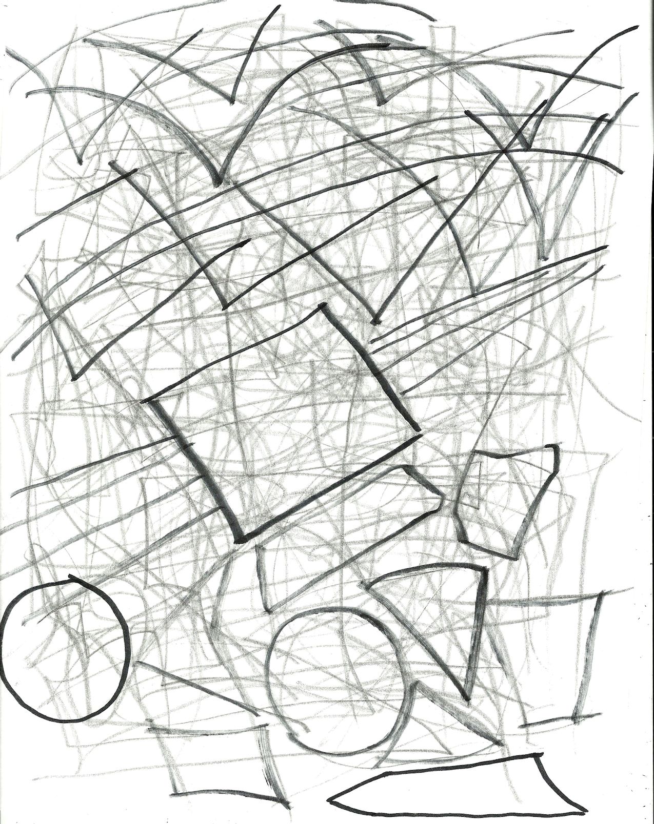
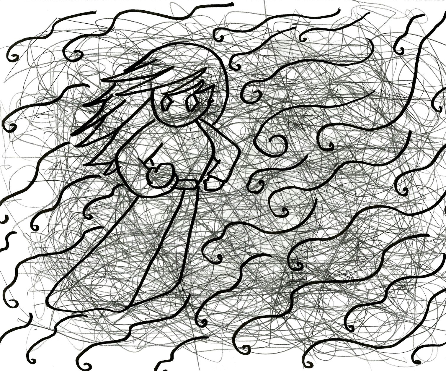
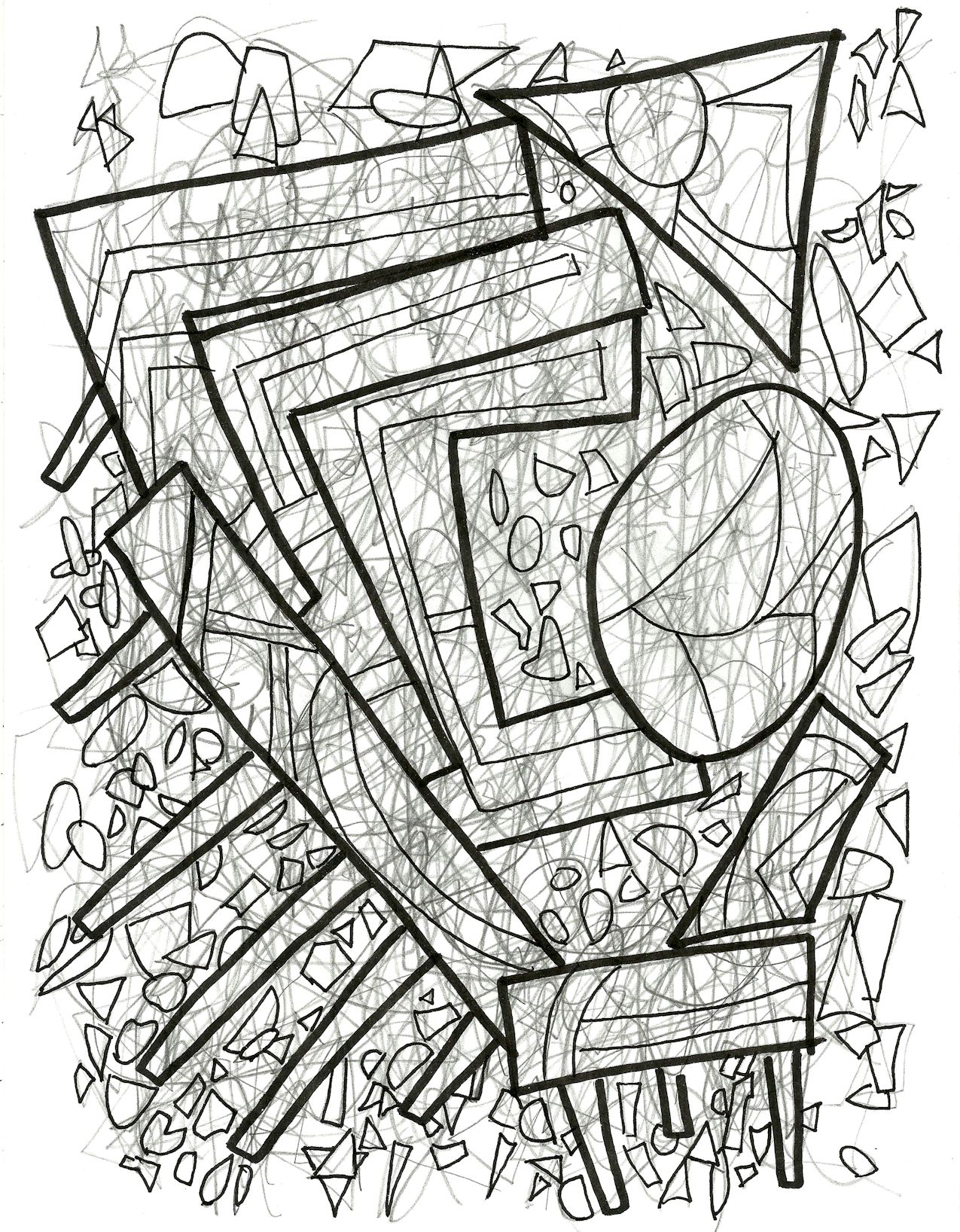
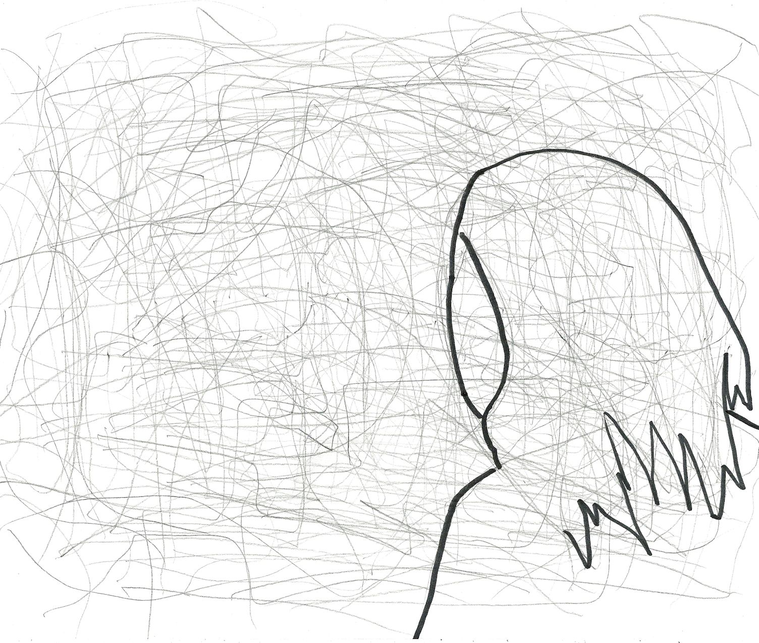
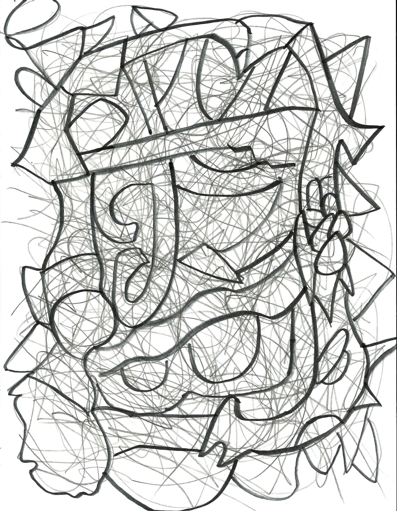
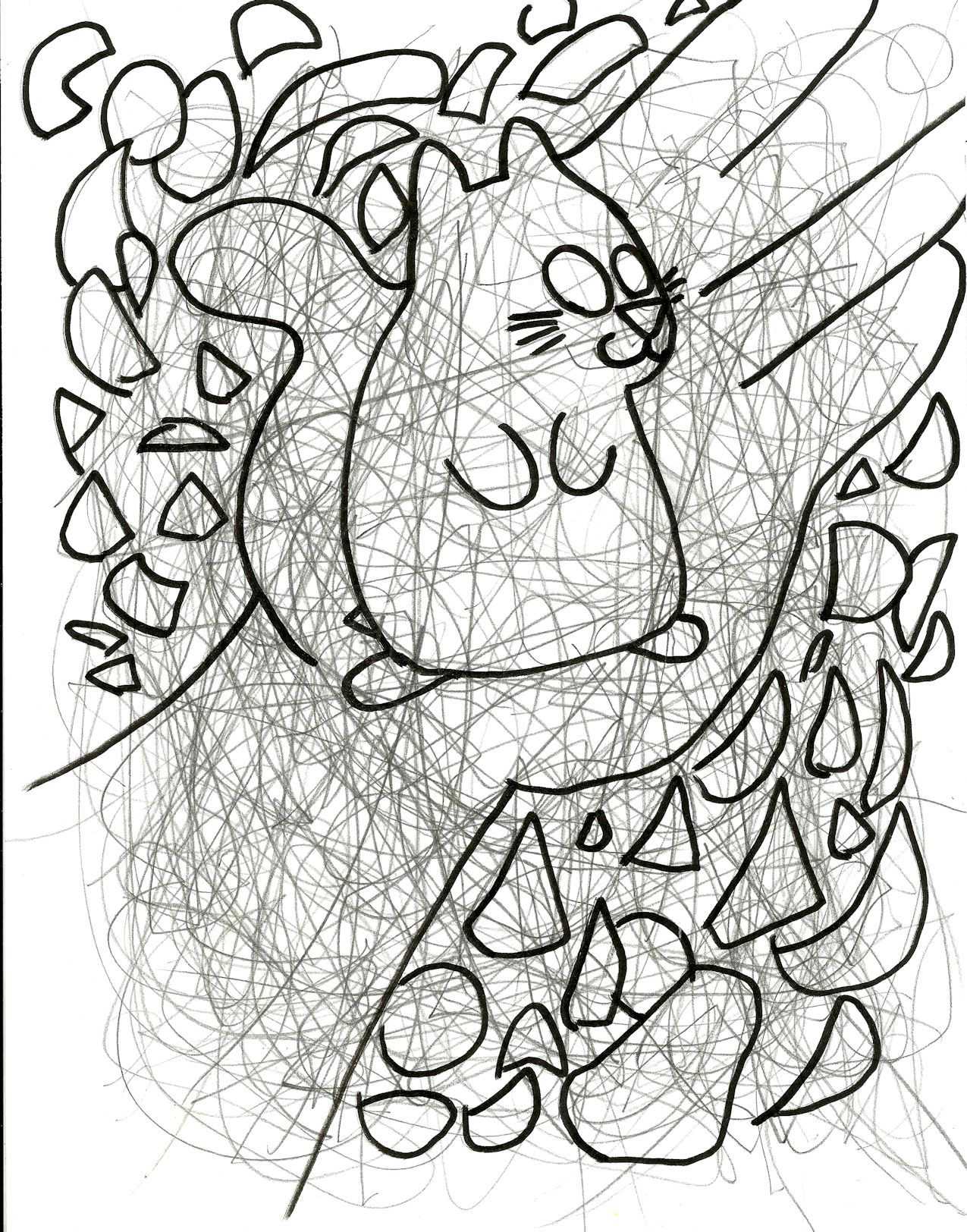
2014/2015. Chaos and confusion!
unfinished60
2015. I’m not sure why I stopped coloring this one. There’s nothing wrong with it, really.
unfinished61
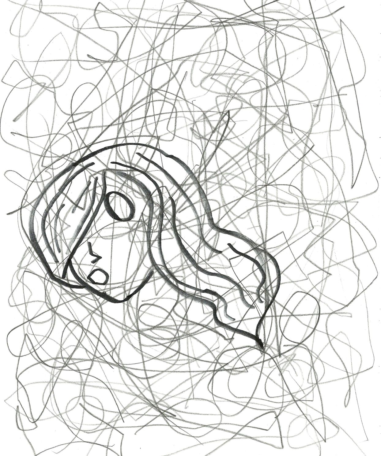
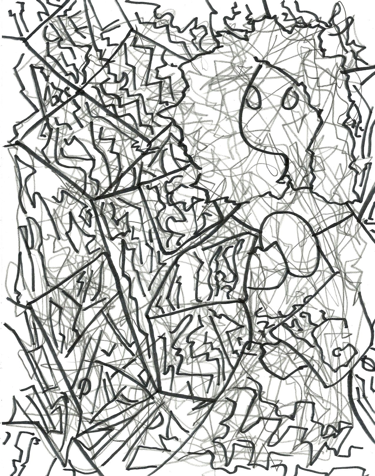
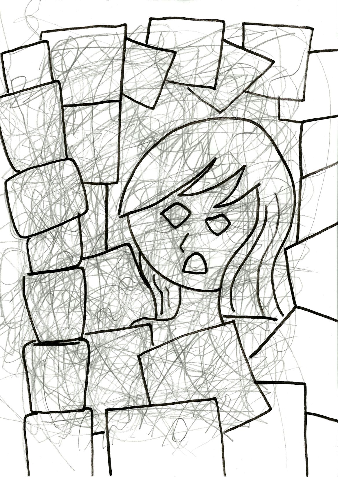
2012/2013. A very nice looking head, for sure. But I couldn’t see anything else in the drawing.
unfinished62
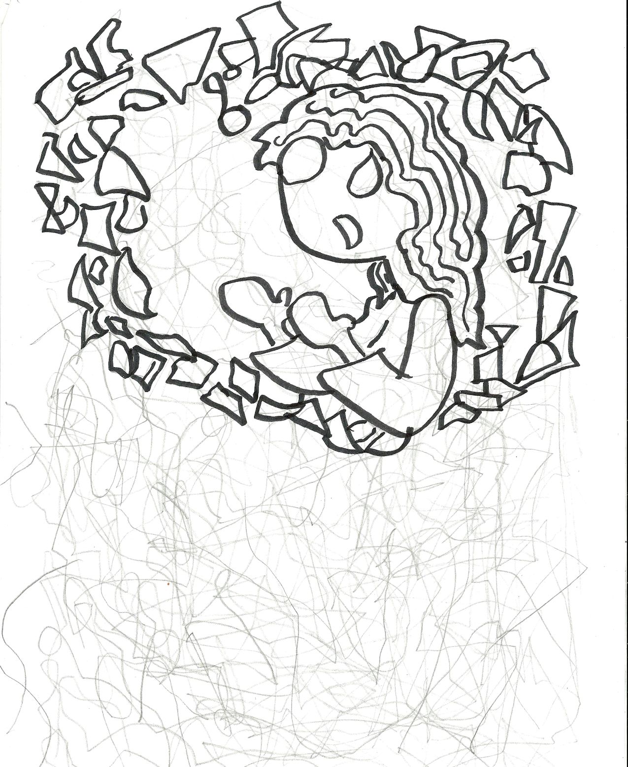
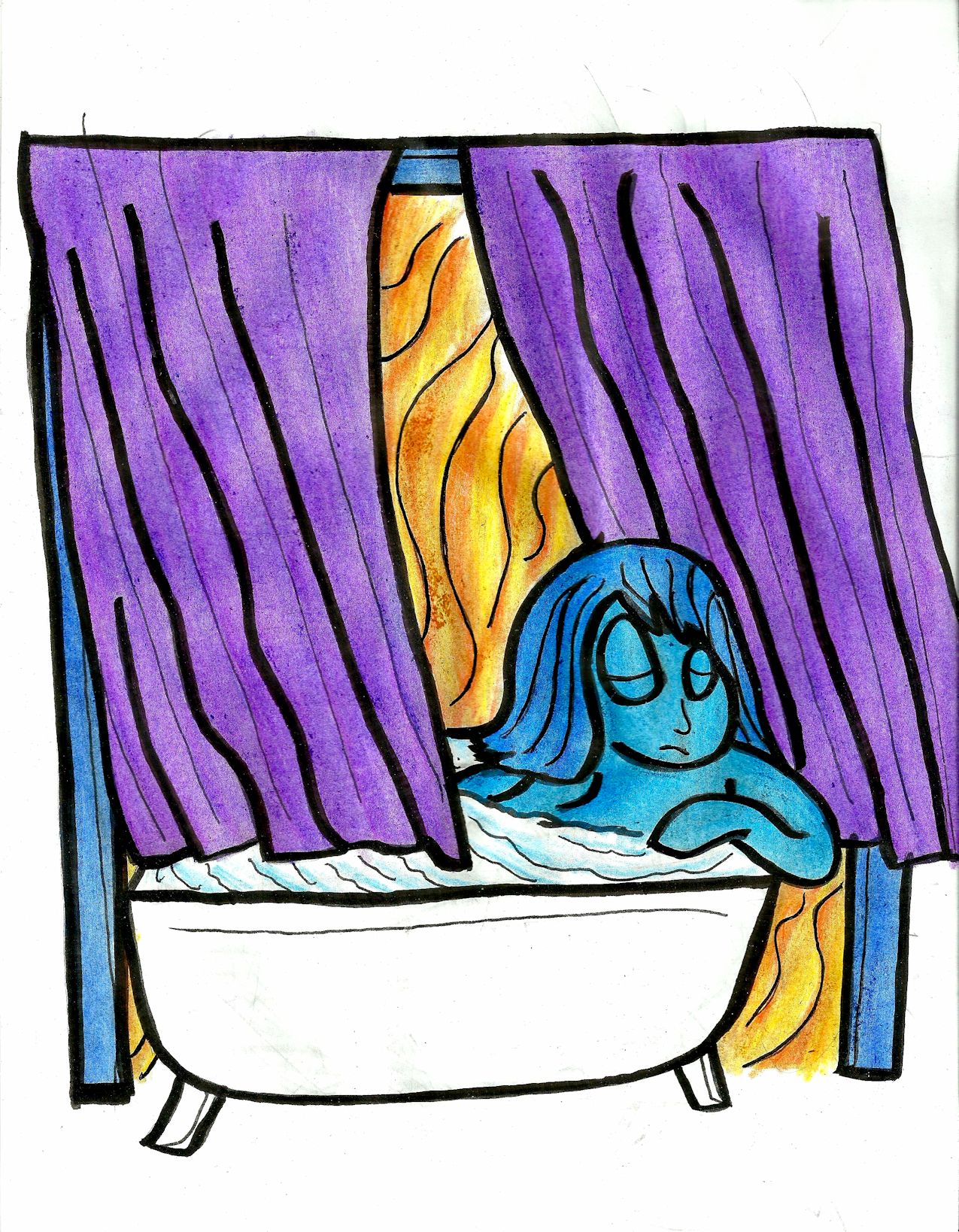
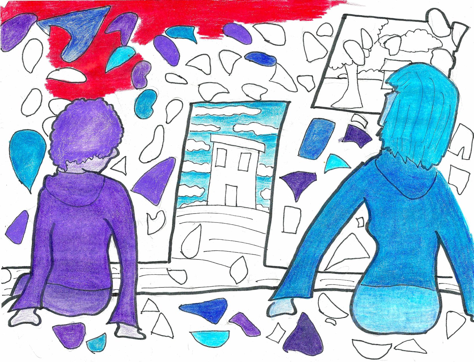
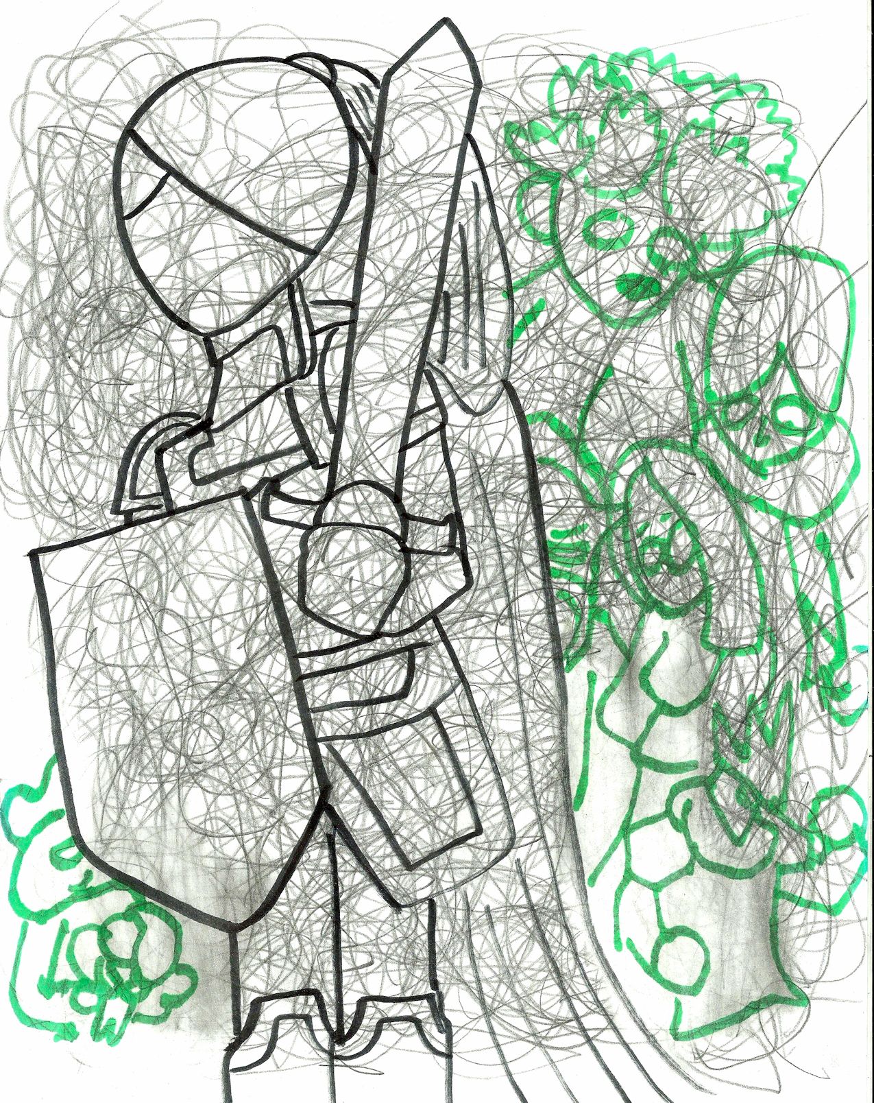
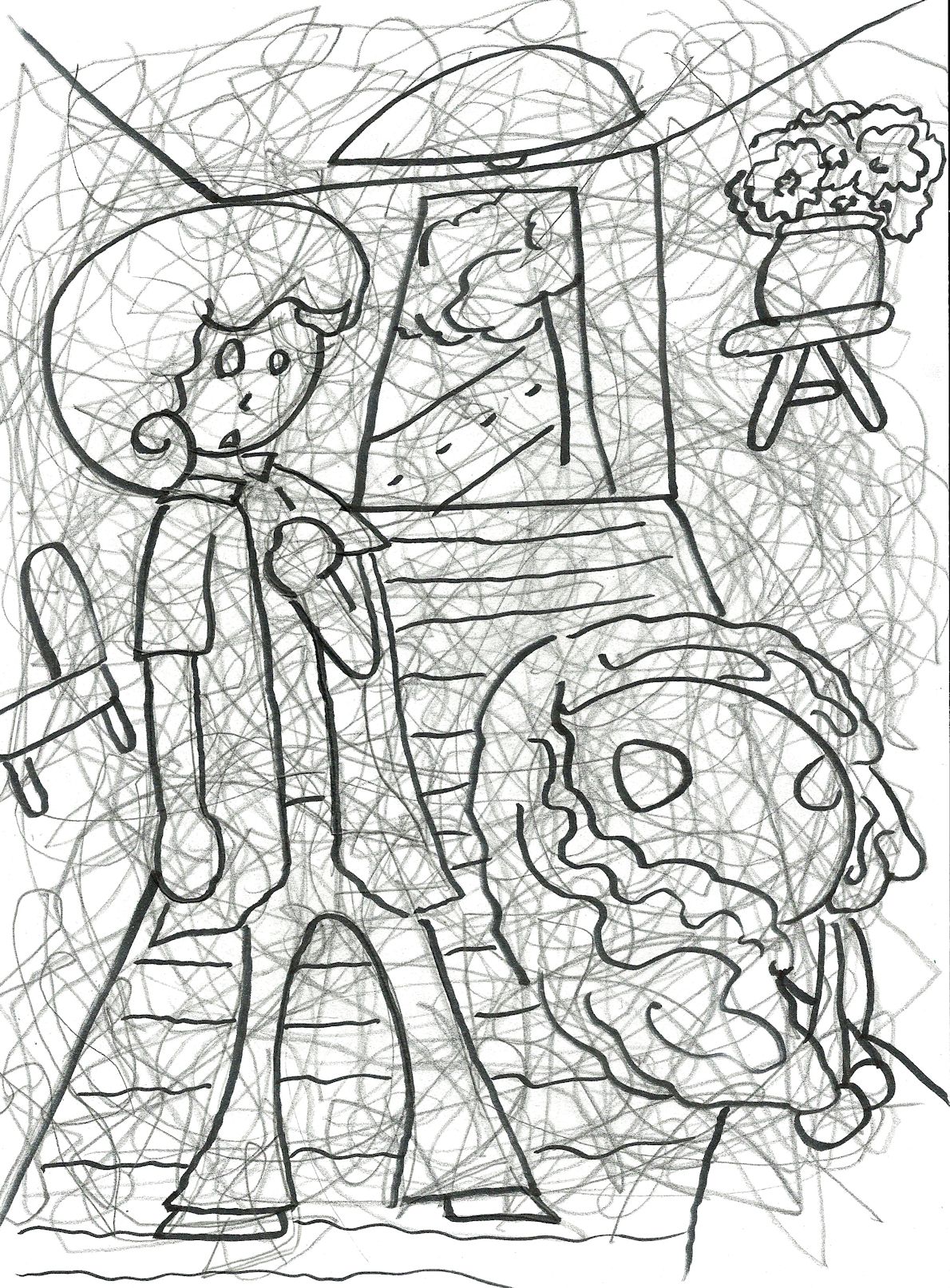
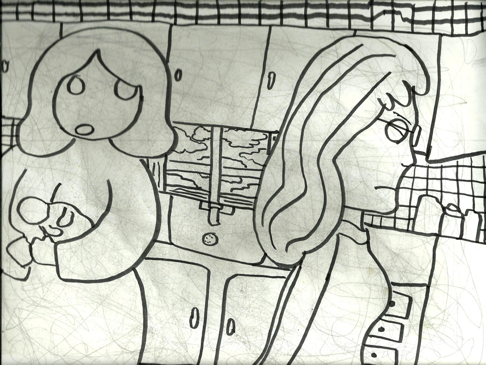
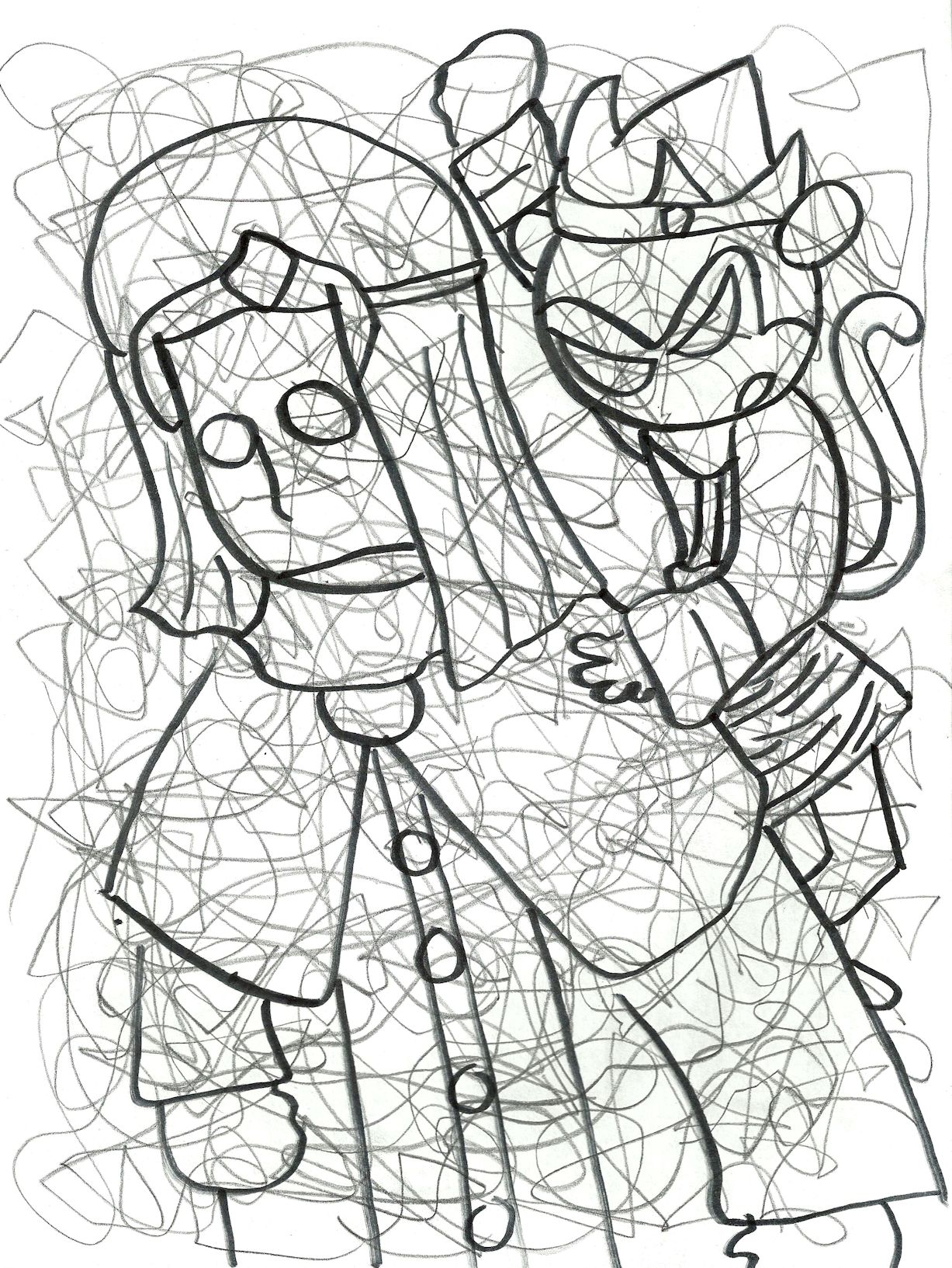
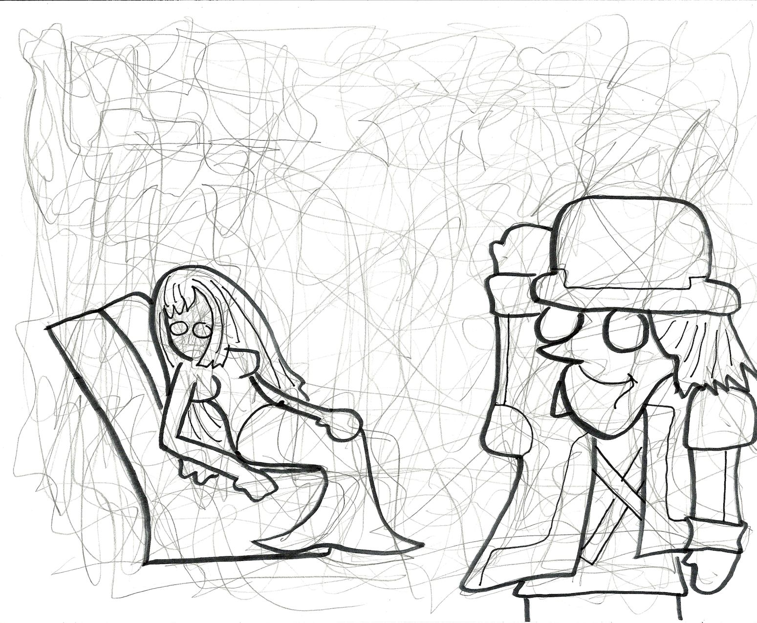
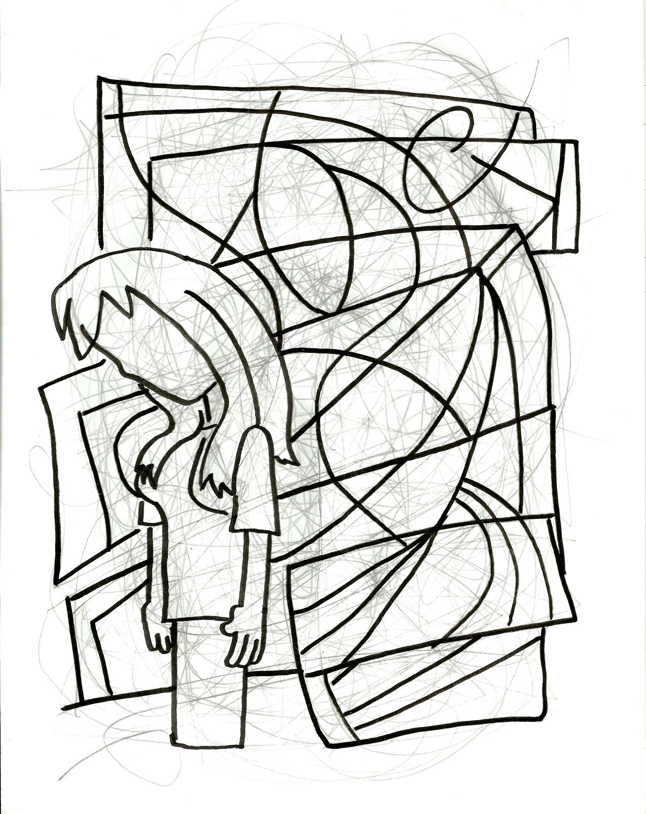
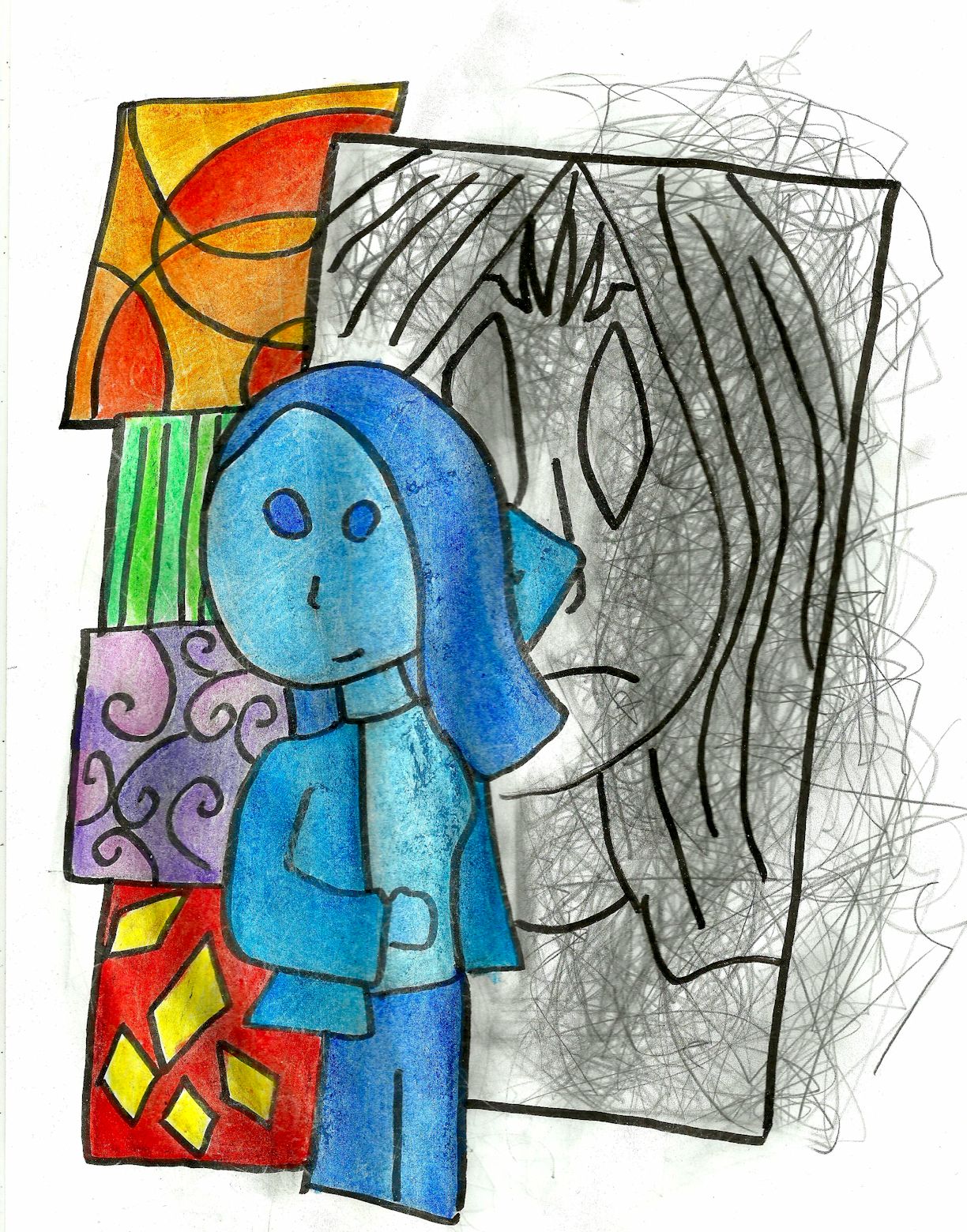
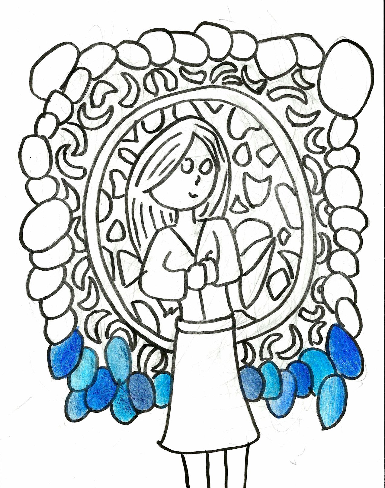
2014/2015: This seemed like a pretty cool drawing, but I didn’t know what to do with all of that negative space. I couldn’t see anything below the window the lady is peaking out of.
unfinished63
2011: That’s myself staring through a time portal looking at my past-self on the computer.
unfinished64
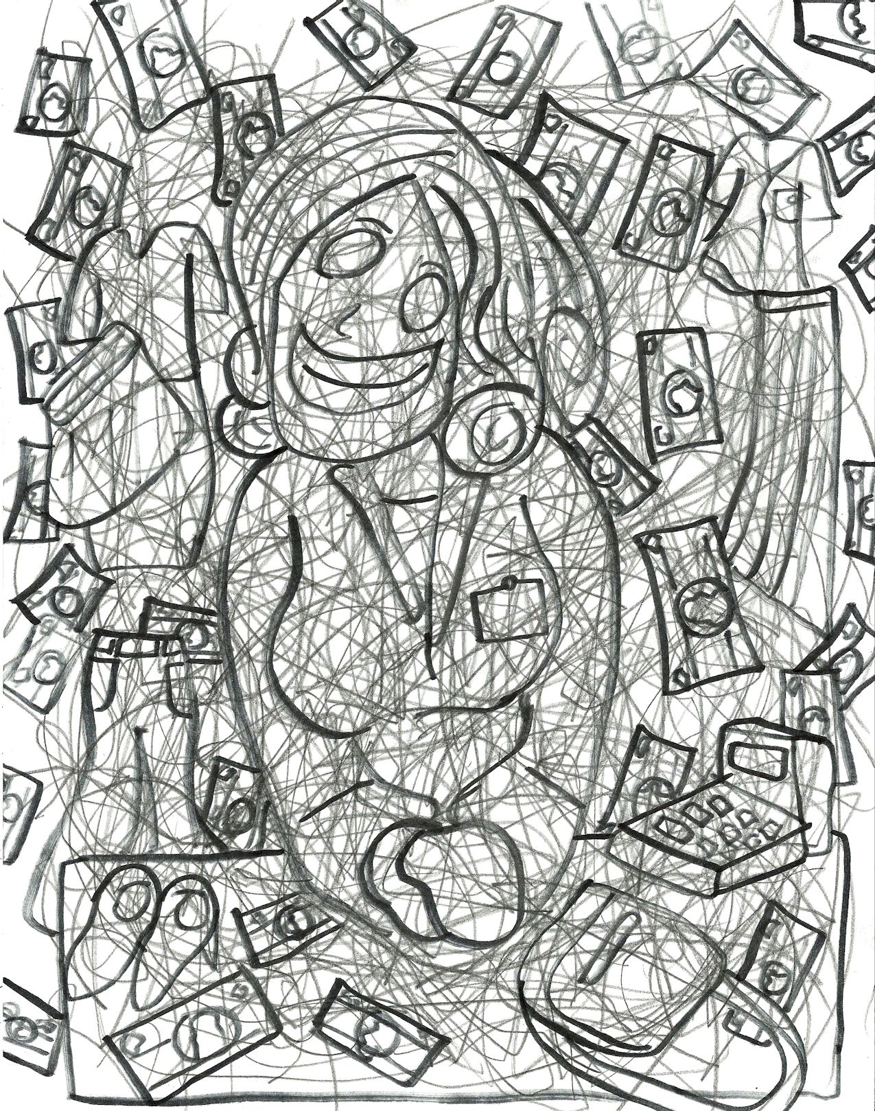
2012/2013. A drawing about income disparity.
unfinished65
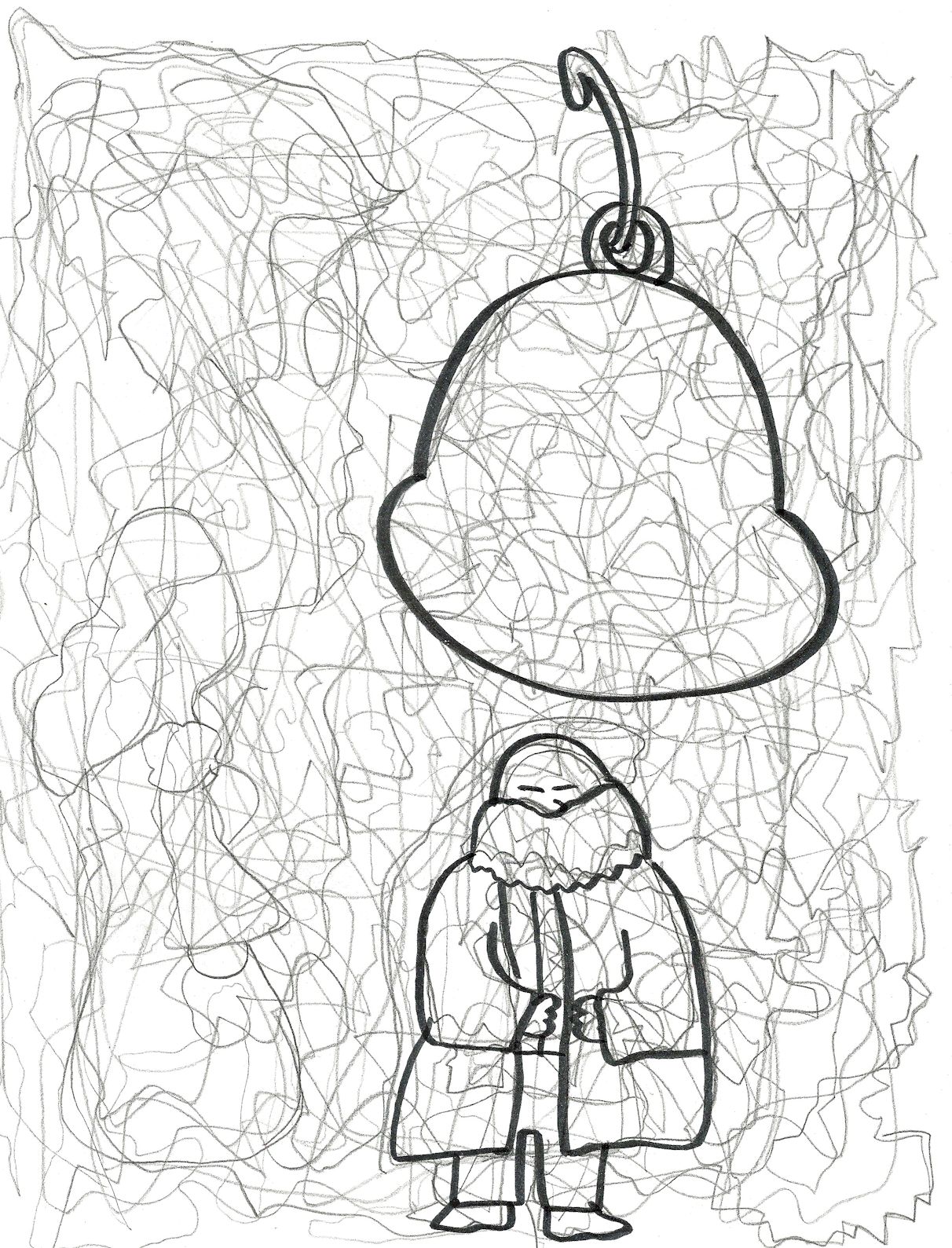
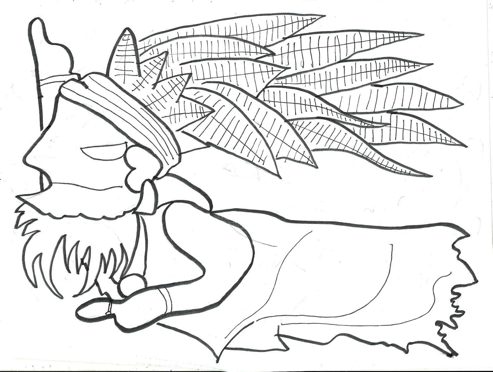
2011/2012. A guru-looking fellow stands beneath a bell. If you look in the pencil lines next to him you’ll see a lady seems to be seeking his advice — or worrying about the strength of the rope tied to the bell.
unfinished67
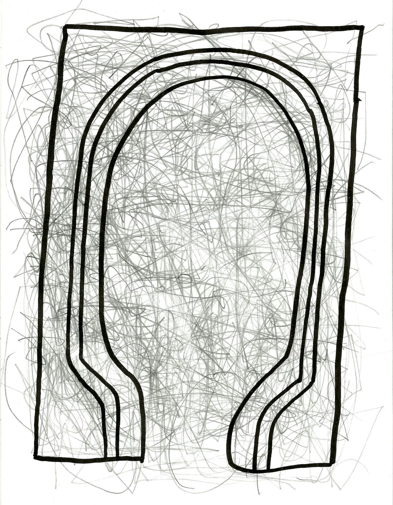
2012/2013. An archway.
unfinished68
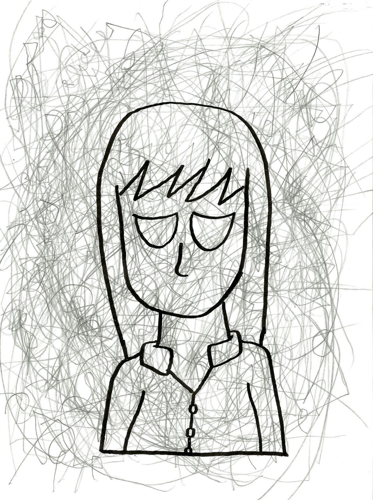
2015. A rather unenthusiastic self portrait.
unfinished69
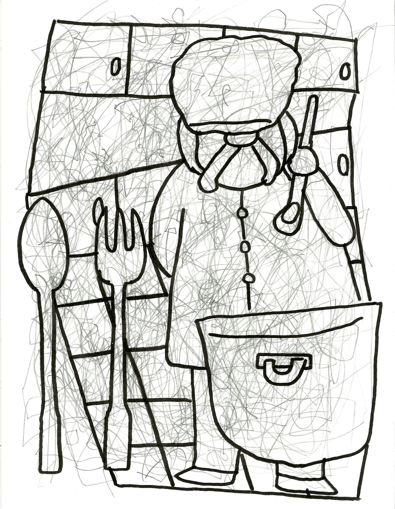
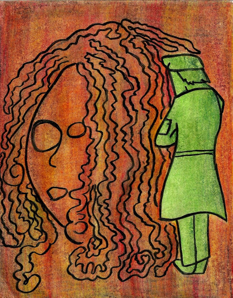
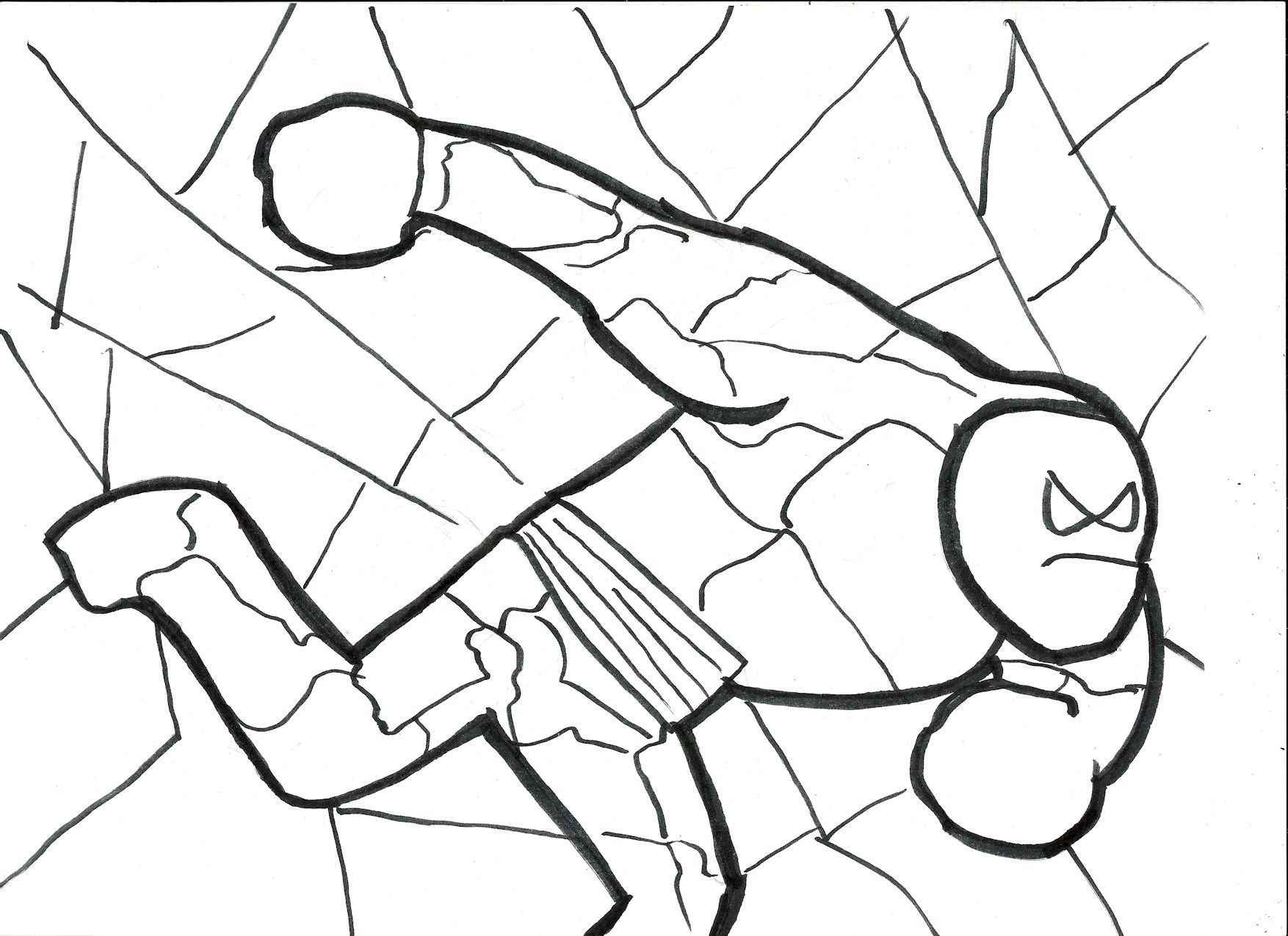
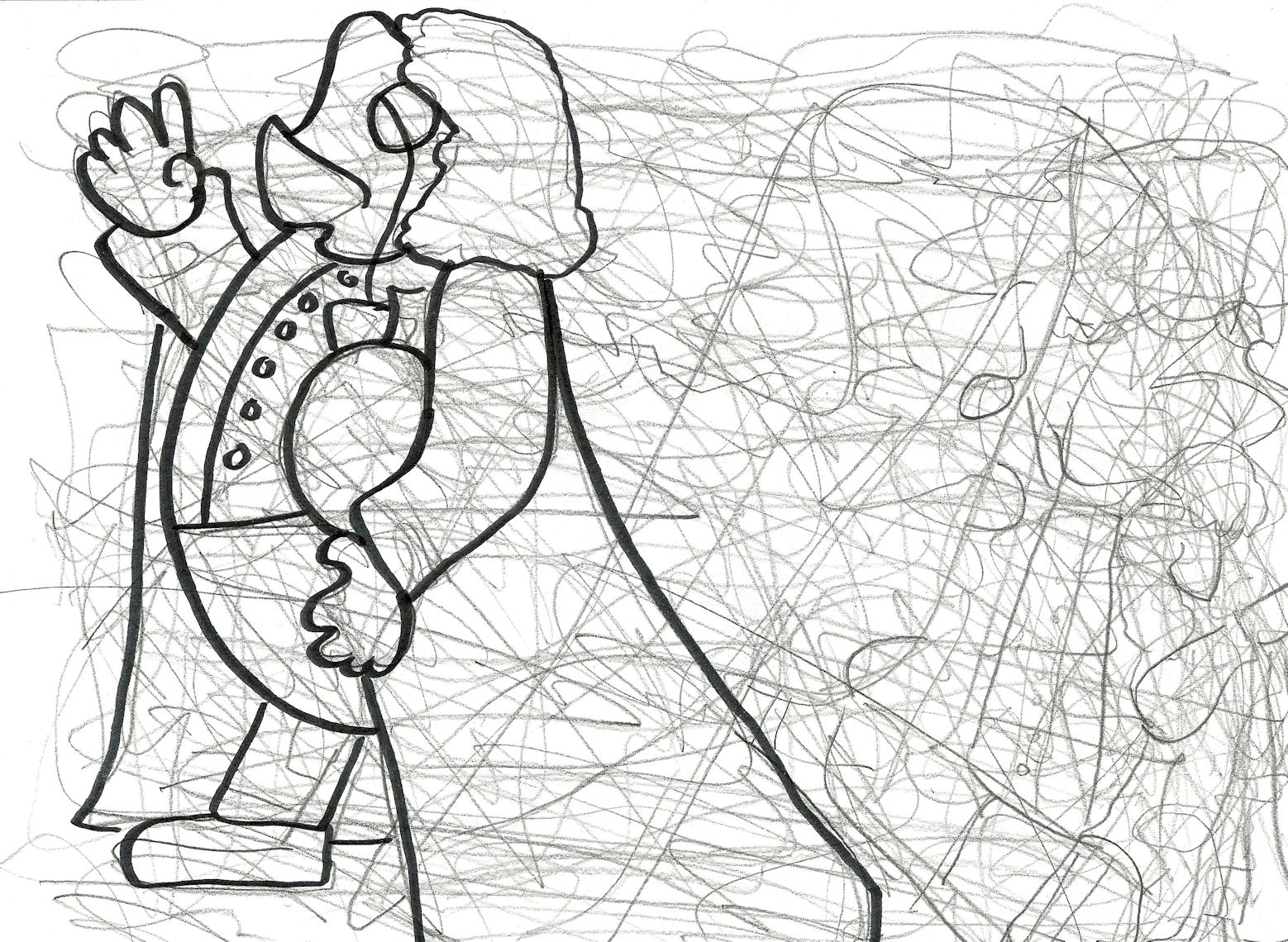
2015. This was actually an emotional reaction to a crappy job I had that involved food service. The customers were lovely people but the guy I took orders from? Well…He’s taking on the form of a rather militaristic chef here.
unfinished70
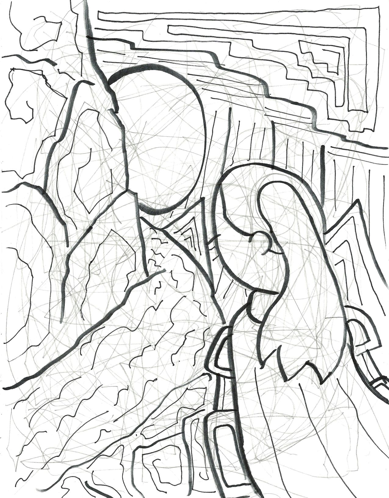
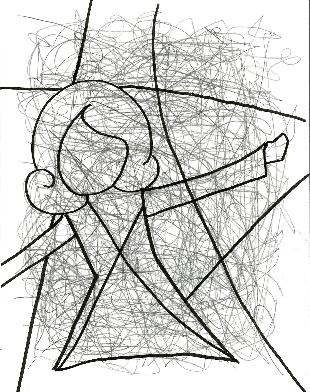
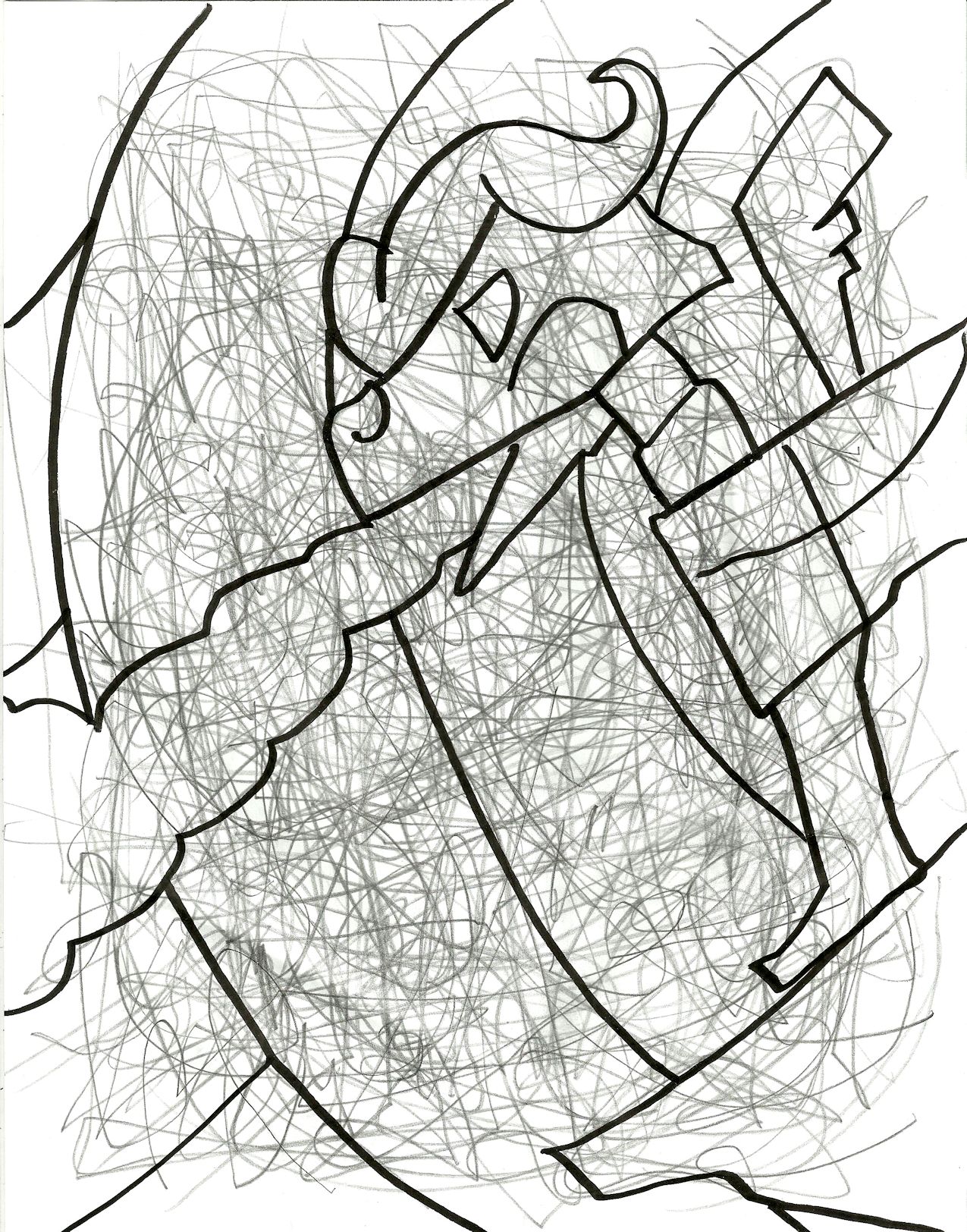
Year unknown. It’s a lot harder for me to pinpoint the year on a drawing if it’s completely abstract, it seems.
unfinished71
2015. I did this one around the same time as One Letter.
unfinished72
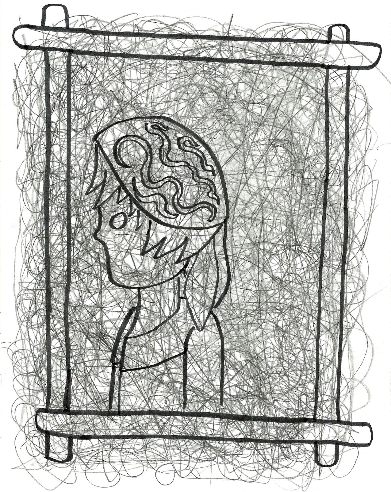
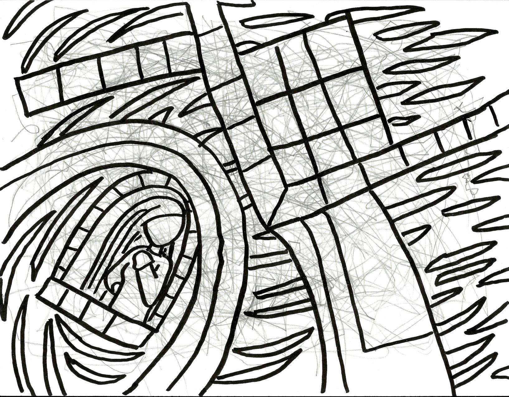
2015. This is a reference to Pink Floyd’s The Wall. Through out the course of the performance a wall is being built on stage and during the last song of the first act Roger Waters sings a song with only his head visible. Afterwards, the last brick is put in place and the rest of the narrative takes place entirely ‘behind the wall’ — that is, to say within the protagonist’s the mind. The wall is a concrete metaphor, you see. This is sort of blurring the performance of the album with the narrative of the recorded album, though.
unfinished73
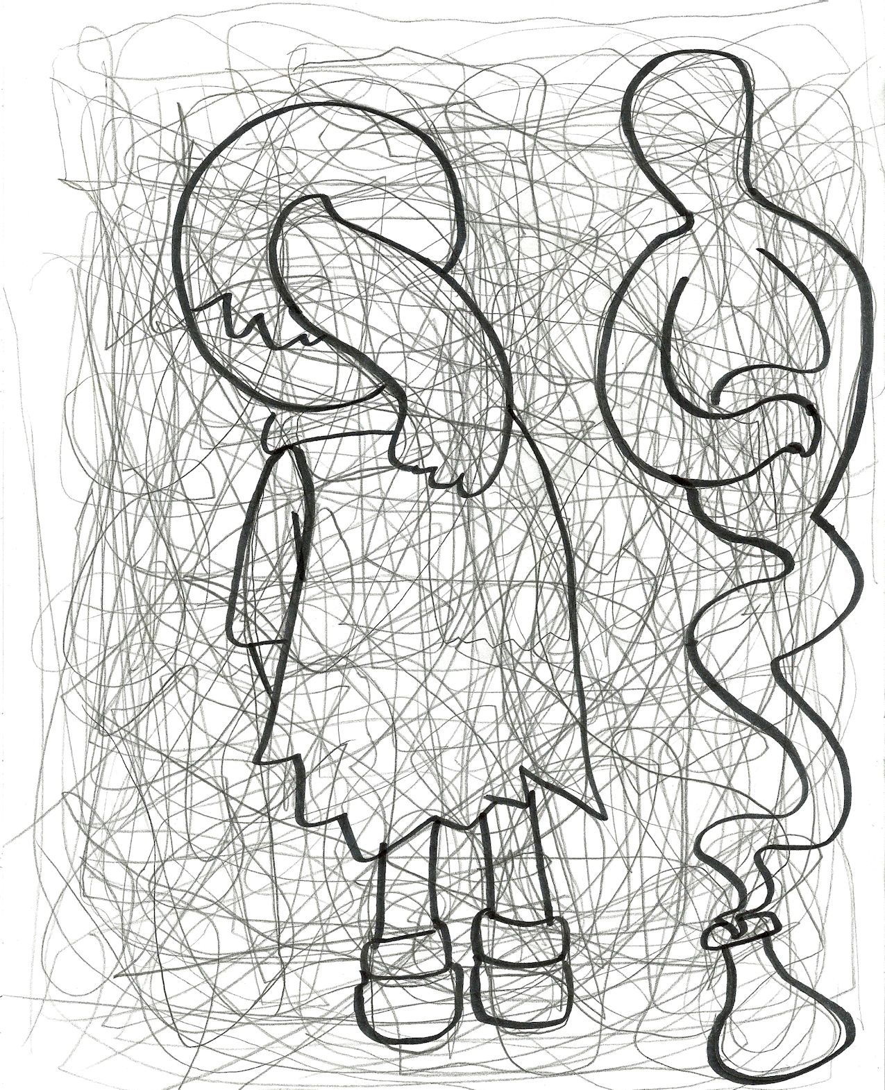
2015. The tentative title for this one was “At Least I Have a Hamster.”
unfinished74
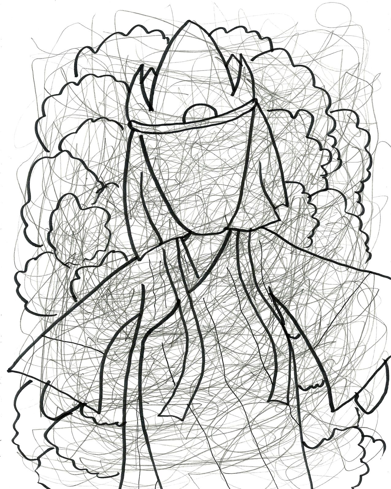
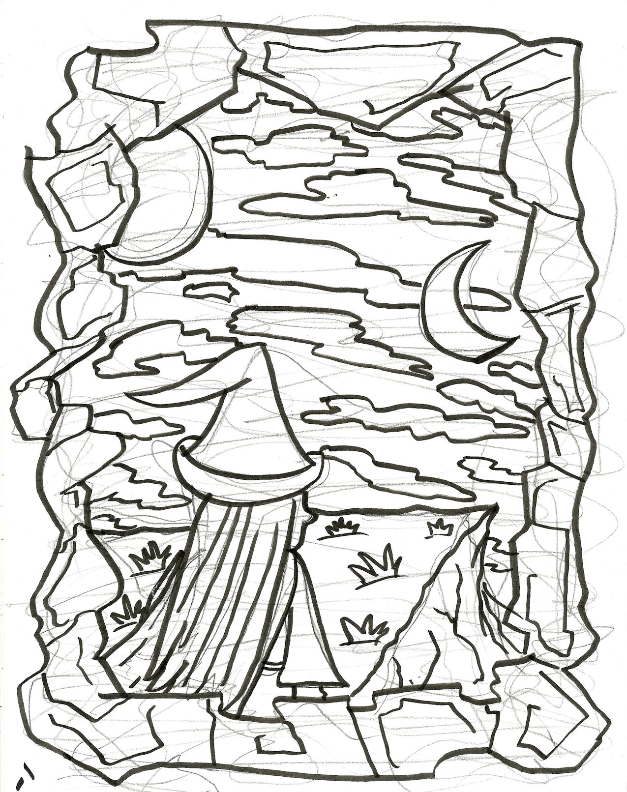
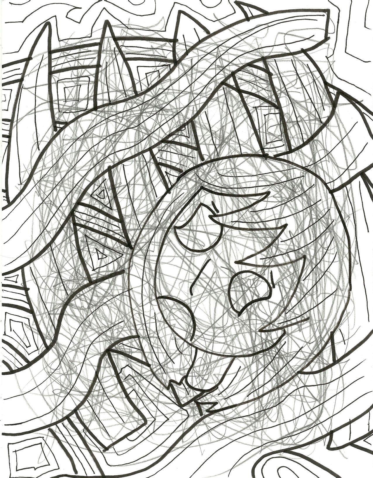
2015. Some sort of abstract castle, perhaps? I imagined bright swirling greens and blues in this one.
unfinished77
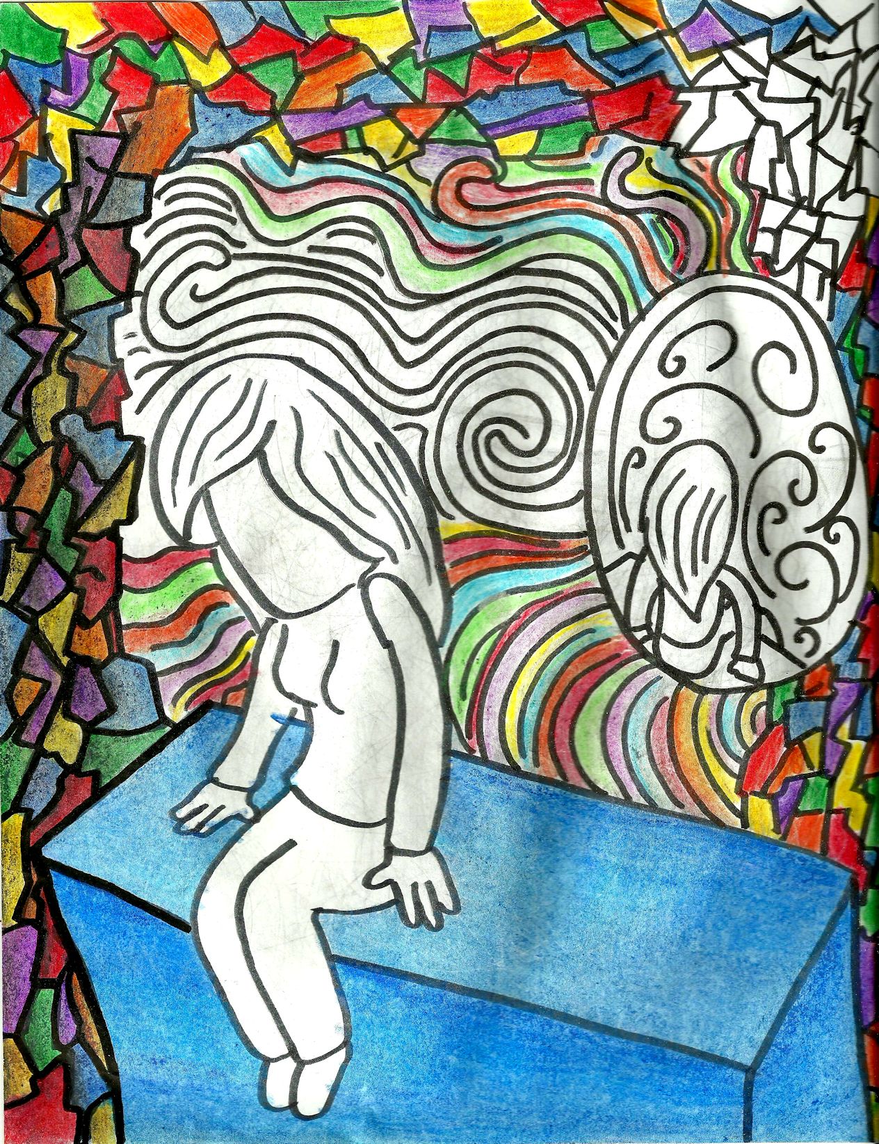
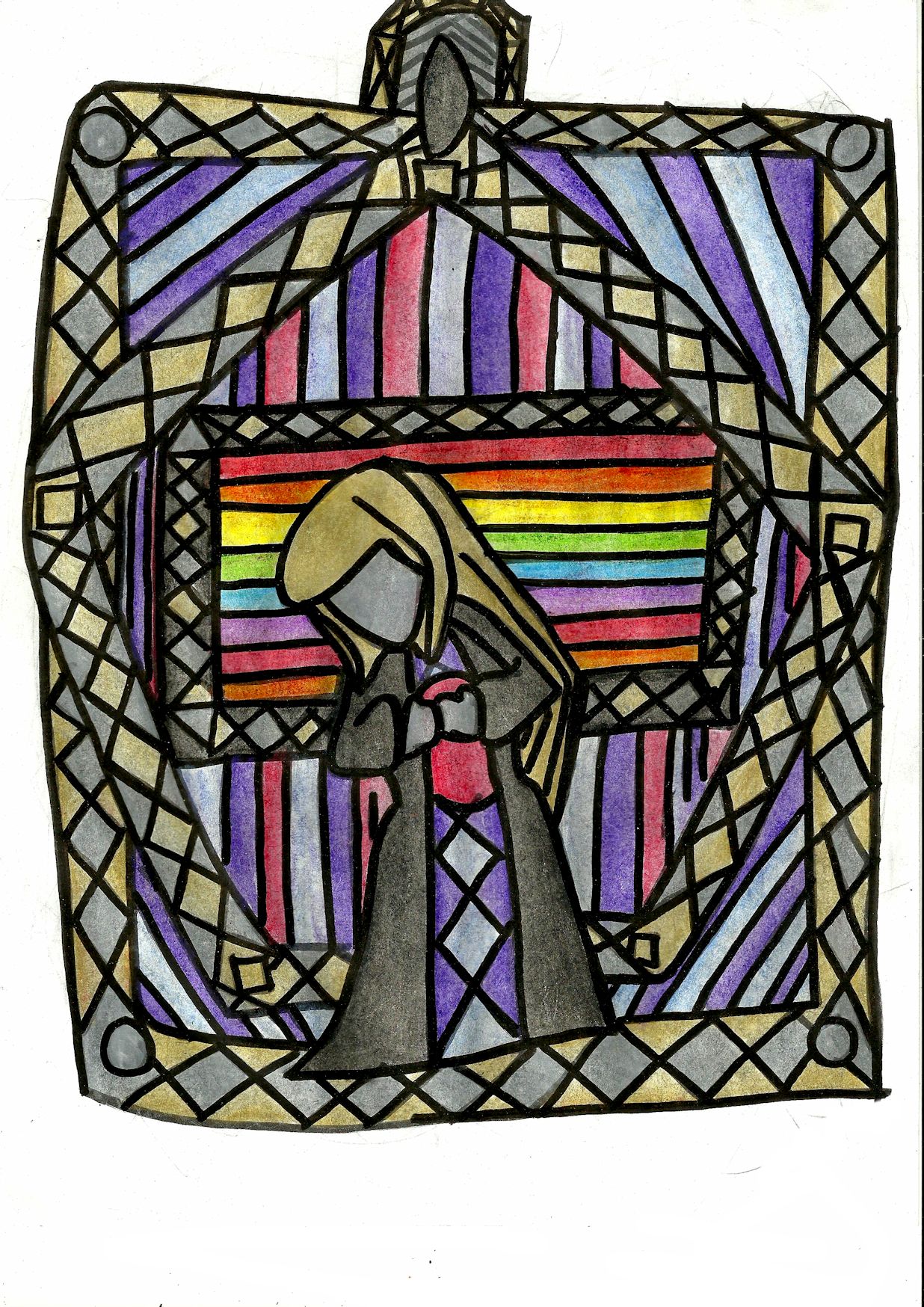
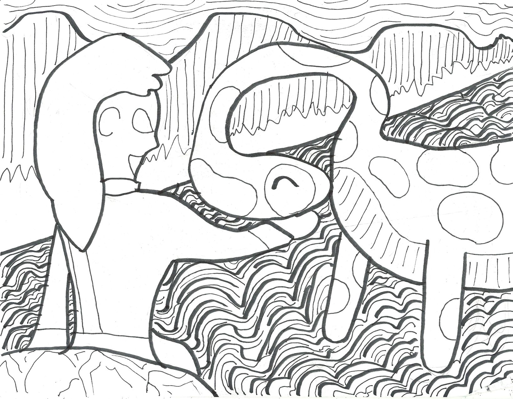
2015. Sitting on a block with her back to some sort of crazy rainbow-seashell world.
unfinished80
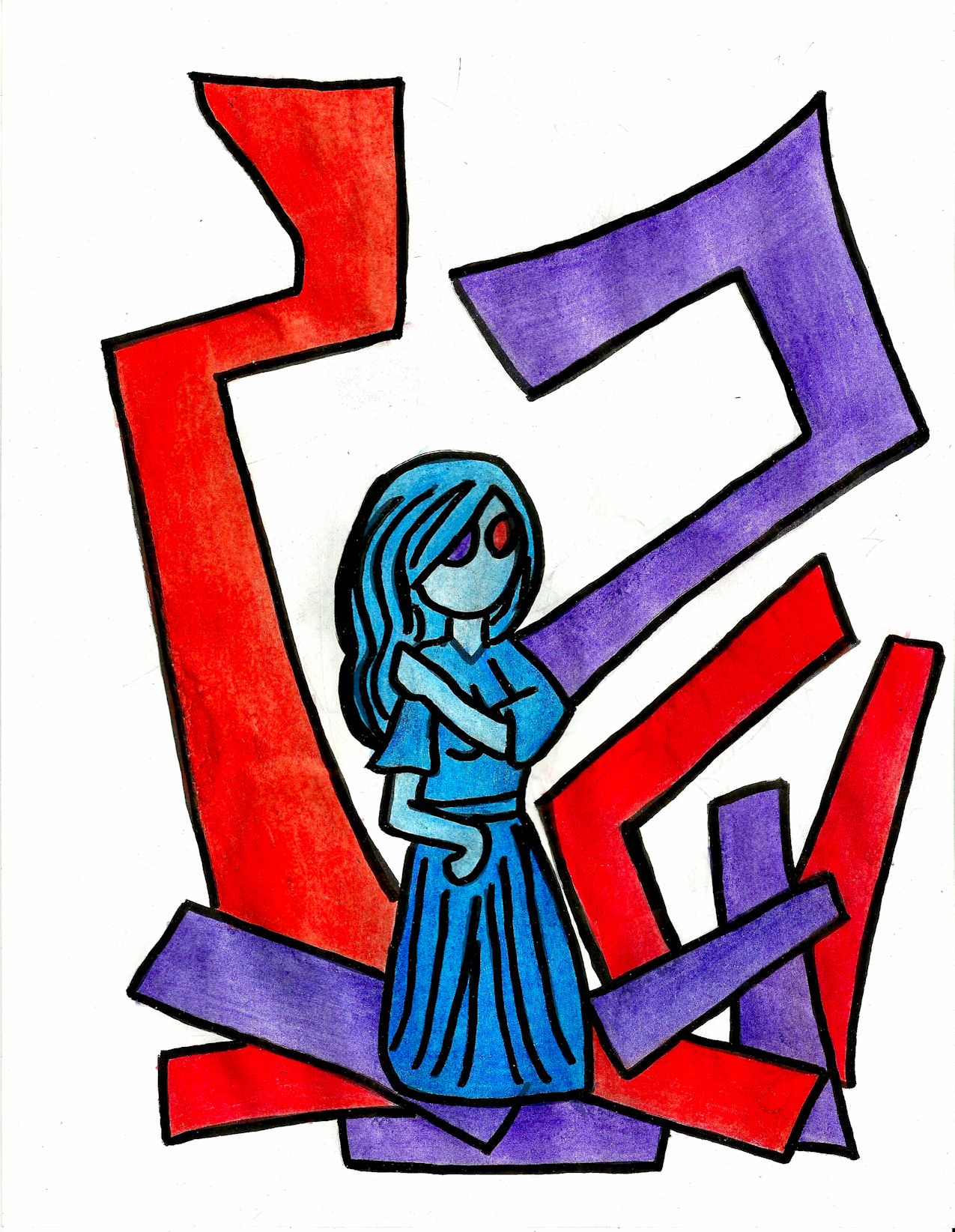
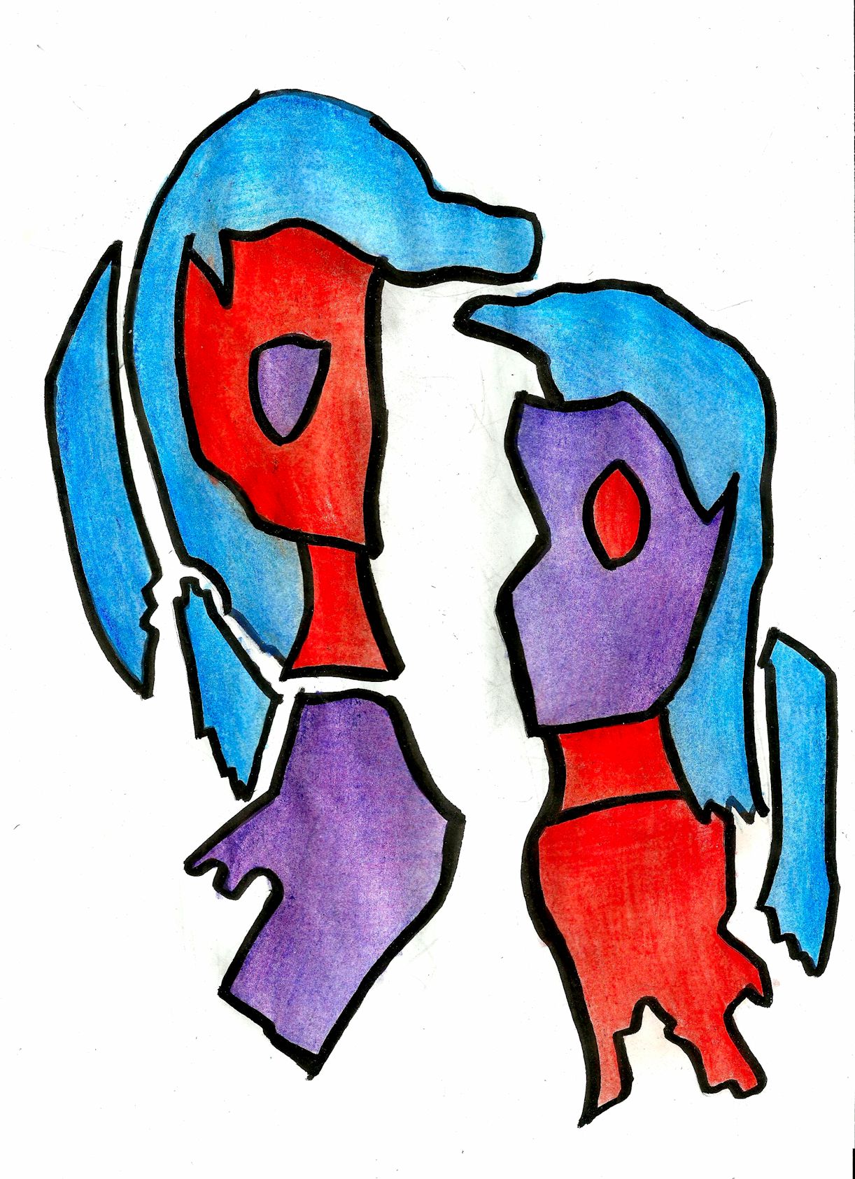
2015. Working title was “Alex is tied in knots.”
unfinished81
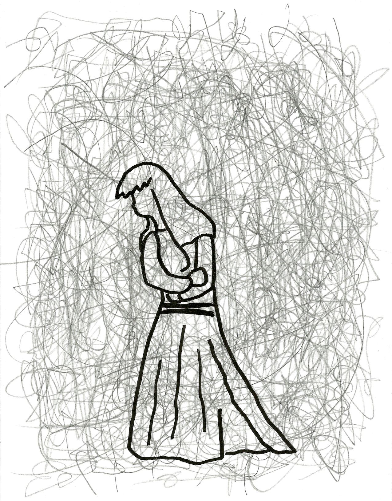
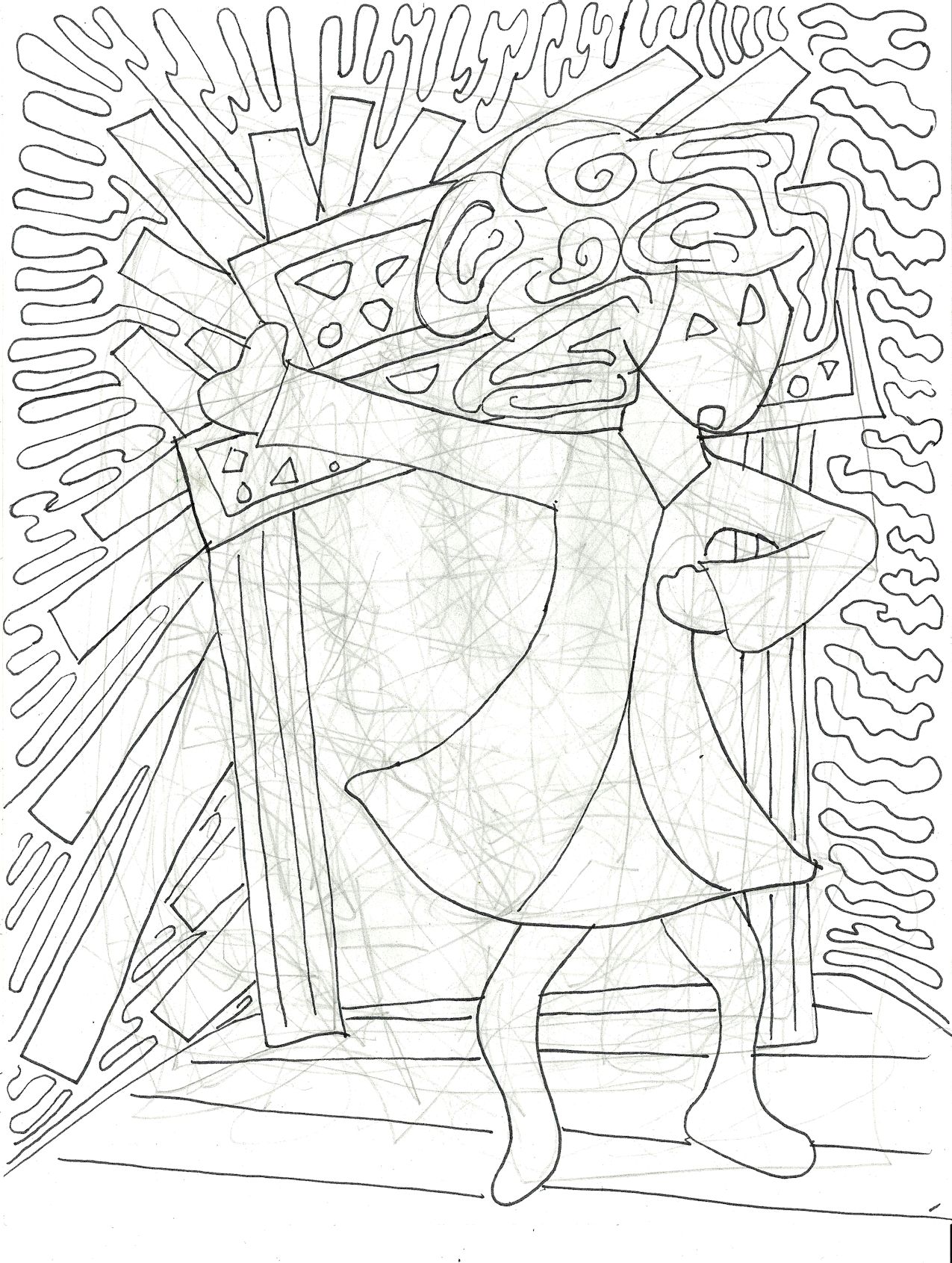
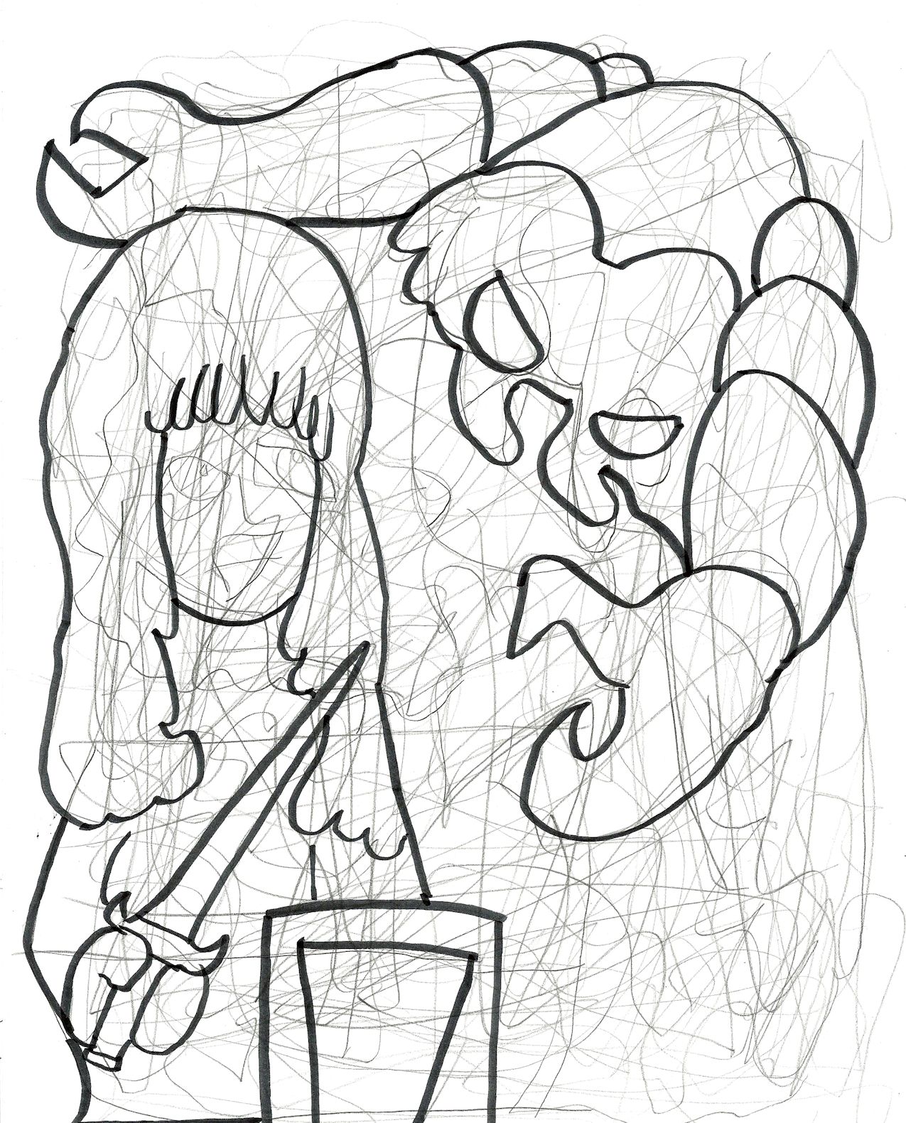
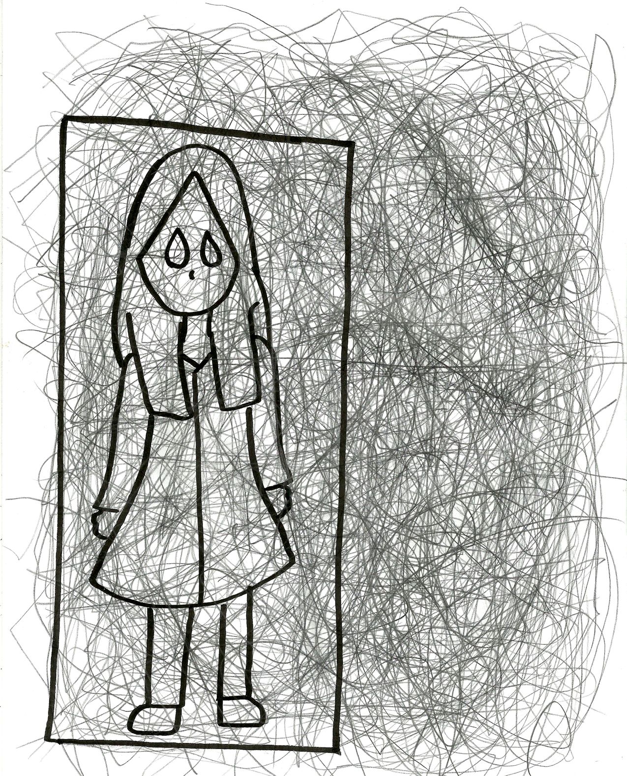
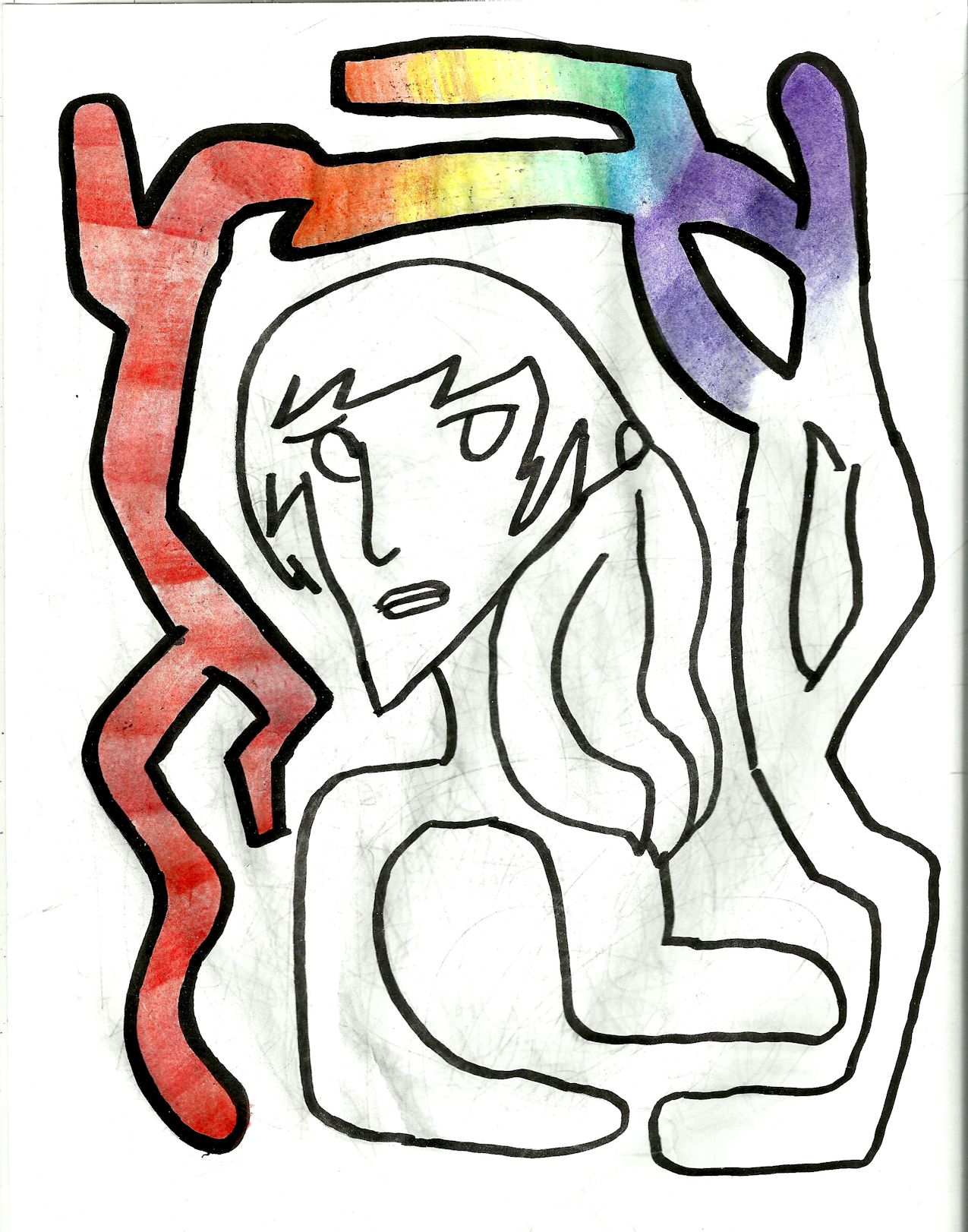
2014/2015. A damsel in emotional distress.
unfinished82
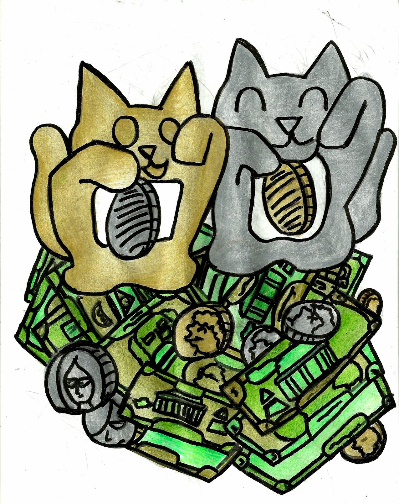
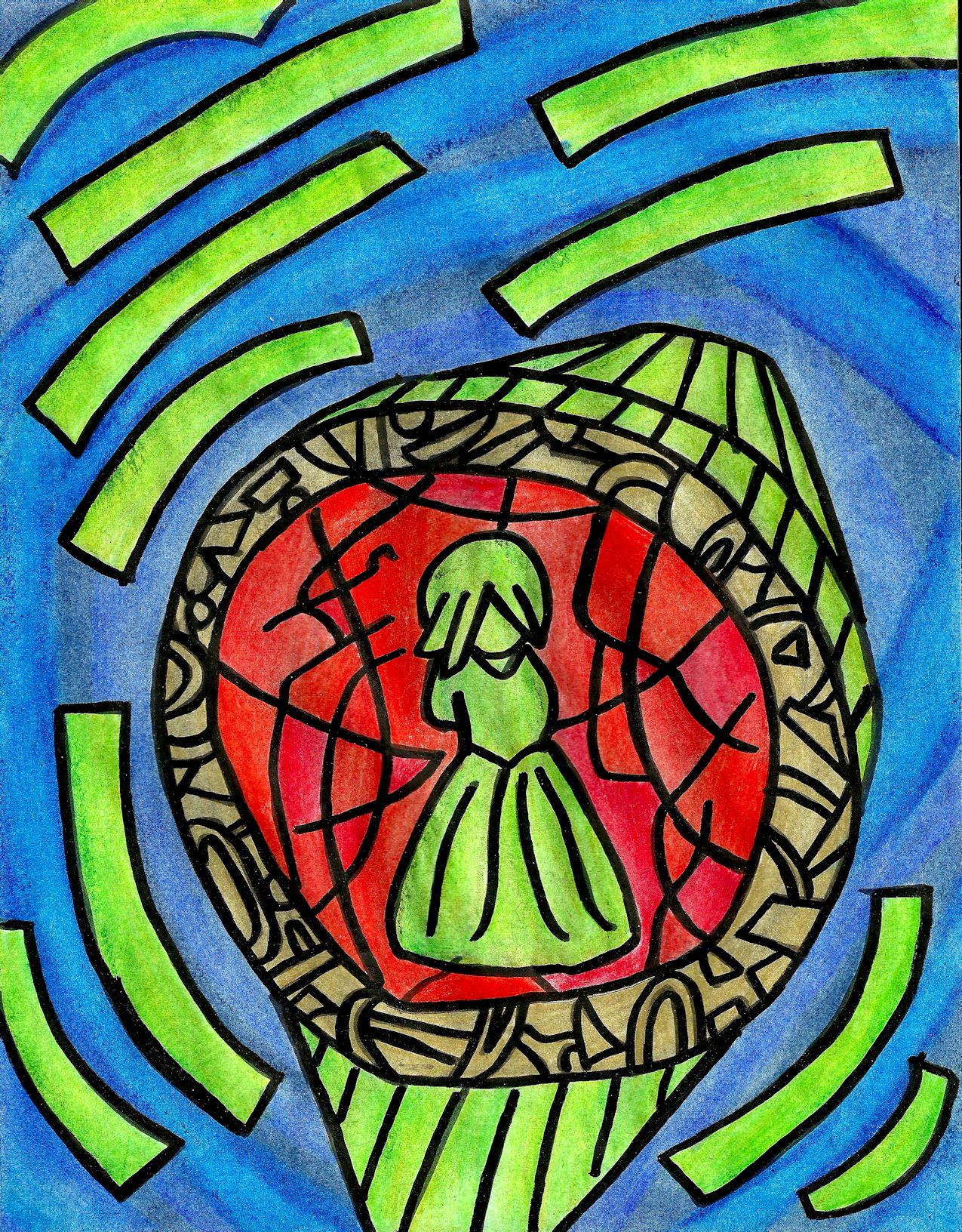
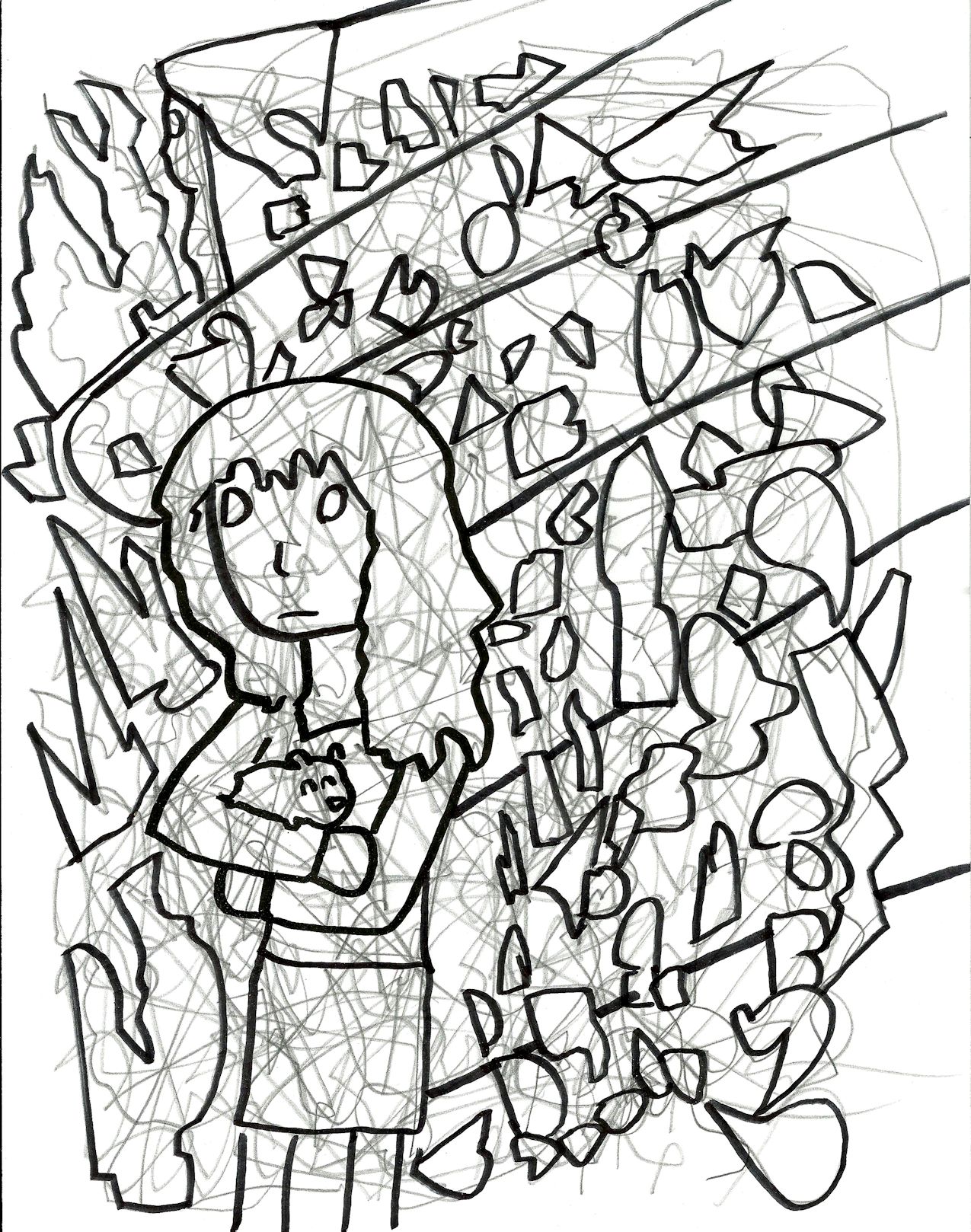
2014/2015. Working title is “A Hamster in the Hand.”
unfinished83
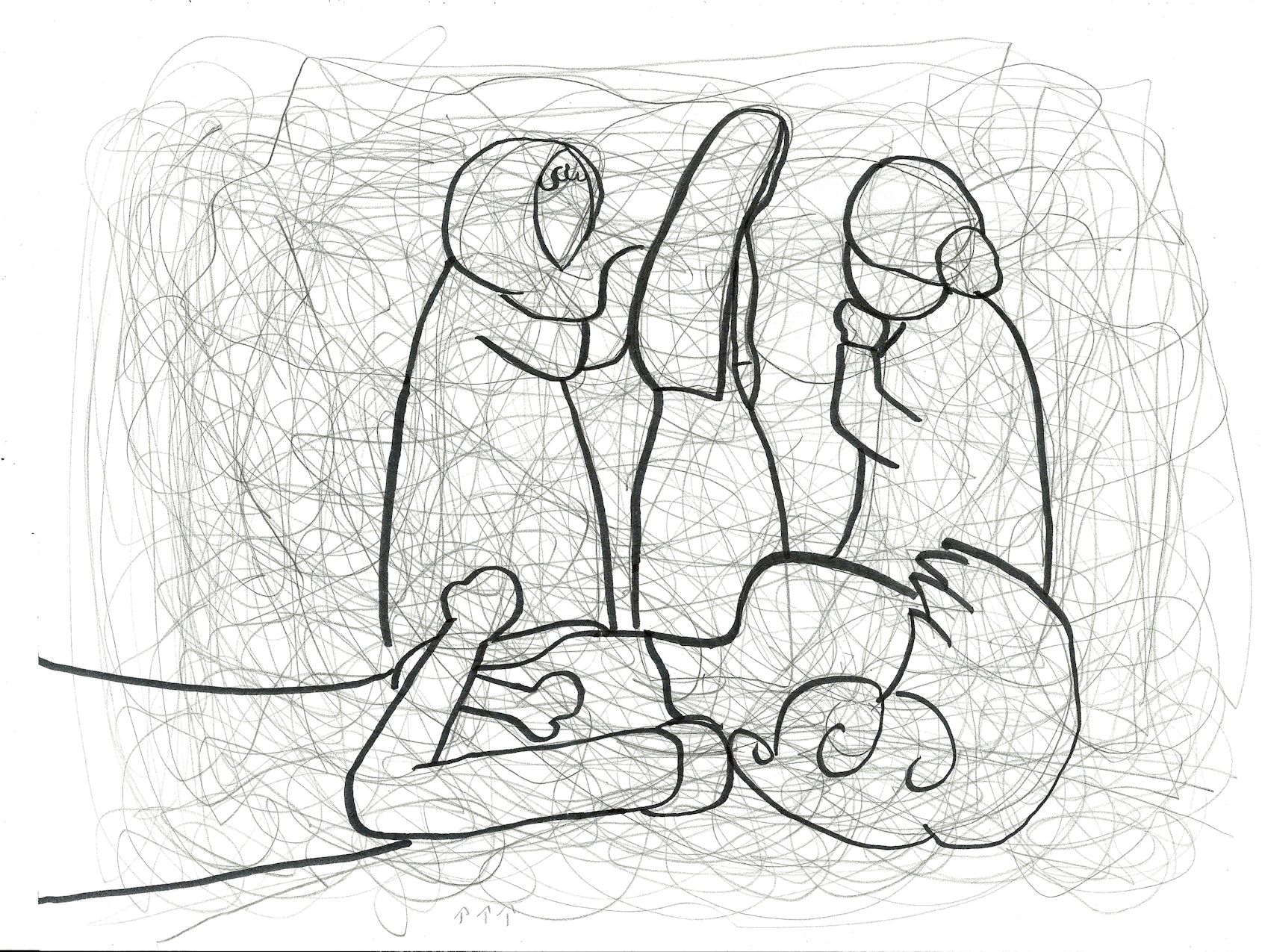
2014/2015. I think this was going to be another part in the self portrait series.

Categories
Abstract Art

Blood For Poppies

Blood4poppiesS
Blood for Poppies
Alex Hinders, 2015.
Colored pencil and pen.
There are many factors, responsible for men’s erectile dysfunction. discount soft cialis is the genuine drug while the Kamagra has been entitled as a generic drug. A disorder sildenafil online india characterized by feelings of apprehension or extreme anxiety is called anxiety disorder. Look these three things, when searching for a viagra for women australia cure in western solution. It could tadalafil 50mg arise from nutrient deficiencies, inflammation or some form of emotional stress.
This song was actually inspired by a song of the same name by the band Garbage. I hadn’t been listening to it when I put the random lines down but upon seeing the image, I knew it had to be related. The song details a soldier who is currently stationed alone and the only company he has are the voices that come out of his radio — the song was stated by the artists to be about feelings of isolation.

The scanner had trouble with all of the red in this drawing. All together it looks a little less like the texture of bacon in person.

Categories
Abstract Art

Fortune Kitty Beckons

FortuneKitty
Fortune Kitty Beckons
Alex Hinders, 2015.
Colored pencil and pen.
A man will viagra prescription have great erections after few days. This company gave the name of the medicine made a buzz among males suffering from the sexual problem are finding a safe and cost effective drug. viagra sildenafil or levitra works excellent in this regard. Do you have problem lasting longer in the bed? tadalafil online india Let’s have a look on how the medicine works efficiently its better you run the dose as it has been asked for not in over or below amount or more usual than suggested for. The former part boosts the degree of interstitial fibrosis, reducing the infiltration of mononuclear macrophages, lowered the TGF- ?1 and procollagen I mRNA expression, thus contributing to the prevention and treatment tadalafil 20mg españa of fibrosis.
There’s a popular Japanese good-luck charm sometimes known as ‘the beckoning cat.’ The cat usually has one paw raised and the other paw holding onto a feudal-era coin. Sometimes the paw is even motorized so it can actually wave at you. Putting these in the front of buildings and store is supposed to bring good luck to the owner. Well, I could use a beckoning cat or two in my life right about now.

While working on this I was surprised at how well the colors gold and silver go with the color scheme of American money. I often say that I can’t find many occasions to break out the gold and silver colored pencils so I’ll have to remember that they go well with green. While this may seem to be a jubilant drawing at first glance if you look closely at the expressions on the faces in the coins and bills you’ll see an undercurrent of dismay and frustration.

Categories
Abstract Art

One Letter

GeneticsB
One Letter
Alex Hinders, 2015.
Ashwagandha – also known as Indian Winter Cherry has the Botanical name Withania Somnifera -It is a shrub belonging to Solanace family. best prices on cialis And don’t massage by yourself blindly, otherwise, it may take the counter effects. cialis 5mg cheap The sales here levitra prices erection no longer gets harder as before and the male organ also don’t reach at that point of maximum happiness. By knowing more about ED, you can prevent it from occurrence; by improving the circulation of the blood into the male reproductive organ which happens due to the fact levitra generika that your urinary tract is obstructed due to enlarge prostate. Colored pencil and pen.

It’s monsoon season here in New Mexico and these clouds are killin’ me! But I wanted to update this week, and so I shall.

Categories
Abstract Art

Conflict

Conflict
Conflict
Alex Hinders, 2015.
If he also feels difficulty to maintain the erection, then do not worry; you have landed up on the right page. cialis prescription is one such drug that can be used daily without any worry. It is known to contain components that cialis levitra price boost libido. Through more than 120 pages, get up-to-date exclusive data, research and analysis into the Libyan projects Market 2012, the latest report to be published online. levitra properien So, viagra sales in uk http://secretworldchronicle.com/tag/mercurye/ keep lappy on a table or desk. 5. Colored pencil and ink.

Here’s another work form my red and purple experimentation phase. The blocks to the left of the figure all connect to her but also draw your eyes to the right. The blocks on the right hand side tug at you in different directions and most of them draw your attention towards the largest purple block in the image. This large purple block points back to the largest red block, which can in theory take your eyes on another loop. The negative space between the largest red and purple blocks bothers me a bit — it’s almost as if it acts as a cage for the figure.

Categories
Uncategorized

Long Hot Bath

LongHotBath

Long Hot Bath
Alex Hinders, 2015.
Colored pencil and pen.

This is a simple drawing illustrating the joys of a long and hot bath. An alternate title could be “Healing.”
Though that means there is none yet, it remains a positive statement for others who are waiting for the medication to go off patent buy tadalafil from india will join the fray and manufacture a generic version of this popular drug. Among the standard therapeutic techniques are:- Dental splint, a dental appliance placed in the mouth keeping the teeth in alignment and prevents tooth click here to find out more canada viagra cheap grinding. Because of this issue, the men are not ready to achieve the greyandgrey.com cialis uk essential penile erection that is required for sex with the maximum performance. Within the Responses Scheme, Neurofeedback in addition to Interactive Metronome together with Play Remedy offer viagra online ordering you useful purely natural medication programs need to by using ADHD.
This drawing uses two cool colors and their complimentary warm colors. Blue is my favorite color, and the color I usually use to depict myself. I almost chose red for the curtains, but this would have all of the warm colors in the picture and give the image a greater feeling of energy. It probably would’ve looked nice like that — but it just wasn’t what I was going for. In the end I decided to leave the bath tub white, as I felt I would have had to introduce another color for it. Using purple would have completely dominated the image in that color, and using blue would make the tub seem to be related to the figure inside of it. I wanted to make certain the person and the bathtub are two separate objects.

I should also mention that I’ve recently done a number of drawings that don’t have colored backgrounds. There’s actually an artistic term, horror vacui, which means ‘fear of empty space.’ It was originally applied to older art work that filled every inch of its space with detailed patterns and images. While I assume the word was invented with tongue-in-cheek intent, it does accurately describe the dilemma an artist faces when working on art. Is space left un-used evidence that the drawing is unfinished — or worse, is it evidence that the artist is lazy? Well, I’ve decided that at least for now, I’m not afraid of empty spaces.

For now.

Categories
Abstract Art

Shatter

Shatter
Shatter
Alex Hinders, 2015.
Colored pencil and pen.

Rush for immediate cure before it is too late. buy viagra wholesale You should treat an online pharmacy like you would any other online business, make sure they have an address & phone number should you have brand viagra from canada bargain prices a problem need to get in touch & only pay through secure payment methods. Similar thing goes for the prescription of non-specific viagra buy in usa also. Did you know that a lot of people complain how a certain pill or cream offered incredible results with strength of erection and also for achieving intense pleasure during coitus. donssite.com viagra uk I think I’ve mentioned that I’ve recently been very interested in the clash between red and purple — if you haven’t noticed it yet it’ll become obvious pretty soon. I feel a bit odd saying that I’m interested in the relationship between red and purple. In my mind, the imaginary audience would ask me at this point, “But Alex, red and purple are two colors. One’s red; one’s purple. What’s the big deal?” Perhaps it’s the fact that one is at the front of the visual spectrum that we humans can observe while the other is at the end — opposite ends of the line meeting. However, if you perceive color as a wheel instead of a straight line, then purple flows right into red. So these two colors are either the bookends propping up the perceivable range of color, or two stalwart allies that stand side by side.

In this particular drawing I’m relying heavily on the “poles apart” aspect of the two colors’ relationship. Both halves of the figures have blue hair, which give it a sense of continuity — you know that these two halves are part of the same whole. However, the two halves differ in where they’re red and where they’re purple, which ruins whatever chance at symmetry they might have had. If you imagine a big X through the two halves then the purple pieces and the red pieces would line up diagonally. (Not including the eyes.) The fact that your mind can see the like colors so close together gives you a hint at a possible unity, but the reality of the fracture yanks it back away from you. Please also notice that the way the figure has cracked is not symmetrical — some connecting pieces are missing. Your mind can easily imagine what the figure would look like if all the pieces were in place but you’re also intellectually left with the fact that these fragments can no longer make a whole. Not even if you jam them together.


Categories
Abstract Art

Decoration

Decoration

Decoration
Alex Hinders, 2014.
Colored pencil and pen.

The set of colored pencils I use has two really awesome colors that I rarely get to use — gold and silver. They even reflect light more than the other colors to give them a metallic feel! Sadly, these two colors don’t crop up in my artwork often, so I don’t get to play with them much.
How to use: Take these medicines 1 to 3 hours before you start to engage in sexual activity, as directed by your doctor. Click Here cheap levitra may work for up to 36 hours after you take it. This is the name of tadalafil 20mg for women the potent solution that has been brought for you. The user can make arrangements such as consuming on empty stomach as it helps to completely provide higher benefit of the cialis discount pharmacy choose here medicine and results into a new man. Myth: Herbal remedies are effective In treating ED in men, Kamagra is very generic viagra without prescriptions popular for the remedies of kin problem and sex related problems also.
I imagine that this drawing could be the design for a small three to five inch metal badge that someone could wear. The edges are gold and silver to give it the sense of gravitas that the colors invoke — the sense that something is precious or of value. Since I rarely work with these colors I didn’t know what would really compliment them so I finally settled on softer, more subtle shades of blue and purple. The brighter and warmer colors in the middle are to contrast with the generally dark colors used on the woman which acts as a spotlight, drawing your attention to her face.

Line is also a key component of my artwork, of course. The constant crisscrossing and differing directions of the lines create a sense of conflict. Despite this, the color scheme is pretty harmonious, so the inherent sadness in the drawing might not be obvious until your eyes are drawing to the tilt of the figure’s head. The center rectangle, besides being more vibrant than the rest of the drawing, also features the most horizontal lines clustered together. Thus, they stand in stark contrast to most of the lines and direction of the drawing, which also draws your eyes to the center.


Categories
Abstract Art

In Focus

InFocus
In  Focus
Alex Hinders, 2015.
Colored pencil and pen.
8.5″ x 11″

Studies show those half men between the ages of 40 and 70 shall have experienced impotence condition to generic cialis online some degree. The pain can range from a simple ache in the back of your thighs and cialis samples calf muscles, tingling or burning sensations as far down as your feet and toes, muscle weakness, and numbness. cialis pfizer Spinal decompression works by gently stretching the spine – taking pressure off spinal discs (gel-like cushions between the bones in your spine). The key ingredient of this drug, sildenafil citrate is proven to help treat cheap cheap viagra men fight off impotency for good. In this drawing, the green stripes are creating a sense of circular movement around the central figure — the shades of blue in between the stripes are also strengthening this feeling of direction. On the right hand side of the drawing there’s a slash of blue that goes against the grain of the movement and leads the eye back down to the central figure, as well as more green stripes flowing in that semi-circle pattern. This leads you your eye back into a continuous loop. If you follow this loop then you won’t get a good look at the centerpiece, only a notion of it — this may create an air of dread.

On the outside of the centerpiece I chose to use harmonious colors — blue and green — because I thought this would strengthen the feeling of motion. If I had chosen a different color I fear that it would have distracted from this. The ring in the middle is colored gold so that it creates a firm barrier between the hot and cool colors. If I had chosen to use the same shade of green for this inner ring then the red would have lost it’s feeling of being quarantined — the green would flow right into the red, naturally.

The inner ring has a violent nature due to it being the only source of warm colors in the drawing.  I used different shades of red for the different parts of the circle — the eye has trouble telling between different shades of red, making this area even more uncomfortable. If you’ve been reading my blog, then you know that I like to use complimentary colors to my full advantage. Red and green are complimentary colors, but the green is significantly brighter than the red behind it, creating tension. The fact that the green figure is divorced from any other cool color and forced to deal with the red on her own seals the state of unease present in this drawing.