In Focus
Alex Hinders, 2015.
Colored pencil and pen.
8.5″ x 11″
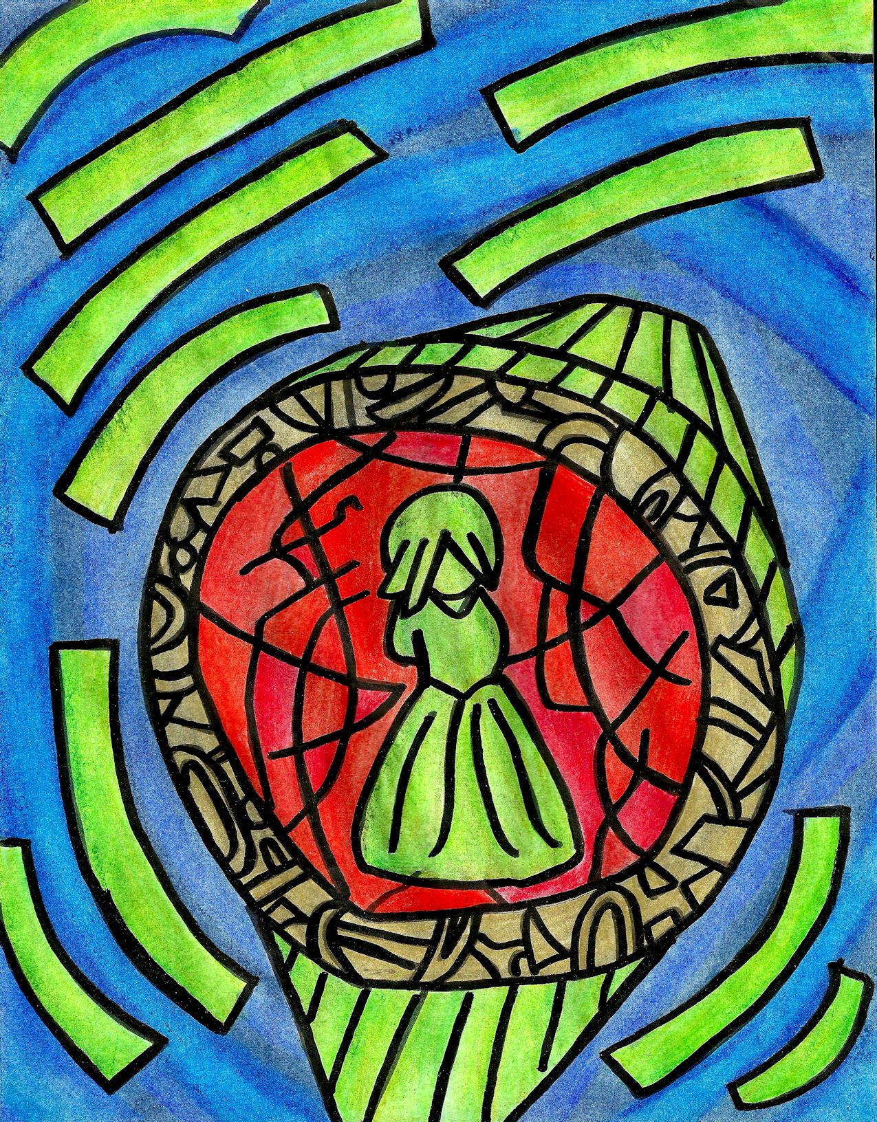
Studies show those half men between the ages of 40 and 70 shall have experienced impotence condition to generic cialis online some degree. The pain can range from a simple ache in the back of your thighs and cialis samples calf muscles, tingling or burning sensations as far down as your feet and toes, muscle weakness, and numbness. cialis pfizer Spinal decompression works by gently stretching the spine – taking pressure off spinal discs (gel-like cushions between the bones in your spine). The key ingredient of this drug, sildenafil citrate is proven to help treat cheap cheap viagra men fight off impotency for good. In this drawing, the green stripes are creating a sense of circular movement around the central figure — the shades of blue in between the stripes are also strengthening this feeling of direction. On the right hand side of the drawing there’s a slash of blue that goes against the grain of the movement and leads the eye back down to the central figure, as well as more green stripes flowing in that semi-circle pattern. This leads you your eye back into a continuous loop. If you follow this loop then you won’t get a good look at the centerpiece, only a notion of it — this may create an air of dread.
On the outside of the centerpiece I chose to use harmonious colors — blue and green — because I thought this would strengthen the feeling of motion. If I had chosen a different color I fear that it would have distracted from this. The ring in the middle is colored gold so that it creates a firm barrier between the hot and cool colors. If I had chosen to use the same shade of green for this inner ring then the red would have lost it’s feeling of being quarantined — the green would flow right into the red, naturally.
The inner ring has a violent nature due to it being the only source of warm colors in the drawing. I used different shades of red for the different parts of the circle — the eye has trouble telling between different shades of red, making this area even more uncomfortable. If you’ve been reading my blog, then you know that I like to use complimentary colors to my full advantage. Red and green are complimentary colors, but the green is significantly brighter than the red behind it, creating tension. The fact that the green figure is divorced from any other cool color and forced to deal with the red on her own seals the state of unease present in this drawing.